SKIP NAVIGATION
Samsung Galaxy S26 Series Design Story Meaning in Every Detail February 27, 2026

In the age of AI, our smartphones stay in our hands longer and more often. What matters now isn’t performance alone, but a kind of comfort you can live with. A feel that stays easy on the eyes, a grip that settles naturally into the palm, and a presence that blends into everyday life without asking too much. The closer AI comes to us, the more essential design becomes, translating breakthrough technology into human experience and beauty.

Precision engineering. Software that expands what’s possible. Design that completes the emotion. Layer by layer, the dedication and craftsmanship of experts across disciplines have shaped the Galaxy S26 series. To begin, meet the designers. Through their interviews, discover how they read the shifts of a new era and shape them into something you can hold, use, and enjoy every day.

*Content images simulated for illustrative purposes only and may differ from the actual product. Product specification may vary by country, region, model, and carrier.

Interview with

  • Portrait of Kilhyun Baek, Product Designer
    Kilhyun Baek MX Business Product Designer
  • Portrait of Joonha Kim, Design Strategist
    Joonha Kim MX Business Design Strategist
  • Portrait of Jihyun Ko, CMF Designer
    Jihyun Ko MX Business CMF Designer
  • Portrait of Yoonyoung Kim, APS Designer
    Yoonyoung Kim MX Business APS Designer
  • Portrait of Seonggyeong Hong, Package Designer
    Seonggyeong Hong MX Business Visual Communication Designer
  • Portrait of Sojung Kim, Design Strategist
    Sojung Kim MX Business Design Strategist

Designed Around What People Do

Design begins with the first touch and carries through every day of use ? made for daily life.

the same corner radius across all three models
Galaxy S26, S26 Plus, and S26 Ultra

All three models in the Galaxy S26 series share the same exterior design, which feels especially striking. There have been similar attempts before, so what was different this time?

Kilhyun Baek We believe a product’s first impression is shaped by its silhouette. Within a series, it should feel like it has a single face. For a long time, we wanted to resolve the subtle differences in character between models.
In last year’s series, we began aligning the corner radius by gradually softening the Ultra model’s edges. With this series, we were able to apply the same corner radius across all three models. To keep the design intent and the day-to-day experience consistent, the standard for the form itself needs to be unified first.

Joonha Kim In the past, the Ultra model’s thickness and pen structure created physical limits that made a shared corner radius difficult. This time, the overall product became slimmer, which made room to unify the form.
Just as important, we had a clear shared commitment across teams. We wanted to get it right this time. That alignment carried through into engineering and development requirements in a way that made true consistency achievable.

For everyday users, “matching the corner radius” may sound a bit abstract. From a design and user experience perspective, what does this change actually mean?

Joonha Kim From the perspective of the Human Side of Tech, a unified form and a softer impression are not just styling choices. They are functional decisions that help people relate to technology more emotionally and build a natural relationship with it in daily life. It reduces the distance you might feel from a hard, purely electronic device. By carrying the message of a companion product into the form itself, the intent is to let the technology blend in on human terms.

Kilhyun Baek To us, unifying the exterior is not only about making the products look consistent. It is about aligning how they feel in the hand and how they behave in use to a single standard. Within one series, “looking similar” matters less than “feeling the same.”
Design is the process of translating purpose into form. If the goal is for technology to adapt to people, the design intention should be seamlessly woven into every aspect, from the overall silhouette to the finest details. Even subtle elements, such as the curve of an edge, play a crucial role in shaping the emotions and impressions experienced the moment it is held.

Ambient Island
Camera Decoration

The camera decoration on this product shows a noticeable change. How did that evolution come together?

Kilhyun Baek With every series, our role as designers is to carry forward the Galaxy identity and heritage, while innovating and introducing fresh elements within its essence. We cannot simply repeat the same form, and users expect the design to move forward as well.
The camera is one of the core features people interact with most often. That is why the camera decoration matters on two levels. It is a structure that supports performance, and it is also the element that sets the product’s attitude and first impression. This time, we focused on preserving our signature identity while translating the camera’s colder, more technical feeling into a sensibility that fits everyday life.
We made subtle adjustments to light, shadow, and color depth to create a soft sense of shading, almost as if the surface has an ambient glow. We refer to this as Ambient Island. It was an attempt to reinterpret a part that can easily come across as a symbol of technology, and instead express it through a more daily, human sensibility.

Joonha Kim At the heart of this design is the intention to make the camera bump feel more refined and visually stable. We focused on configuring the design so that the high-performance camera module appears less visually prominent. The goal was to ensure that the performance-driven structure designed for functionality feel intuitive and natural to the user.

The term Ambient Island is especially memorable. What kind of emotion did you want this design to convey to users?

Kilhyun Baek If last year’s Galaxy Z Fold7 camera decoration felt more assertive with its metal finish, the Galaxy S26 series takes a softer approach with a gently translucent material. That shift lets the camera module subtly show through from the side, so it feels almost like it’s floating.
What mattered to us was not only the form, but the way light and shadow settle on the product. The goal was to transcend the camera's role as a mere symbol of function and reinterpret it as something that resonates emotionally with users. It is a high-performance product, but it is also something you hold and live with all day. We wanted it to feel more like a companion in everyday life.

Galaxy S26's slimmer form factor

The slimmer form factor and a more comfortable grip are key characteristics of this series. Beyond the hardware constraints, what were the most important design considerations in bringing that experience to life?

Kilhyun Baek In our process, we start by making and holding physical mockups. Grip is not something we decide by numbers alone. It is decided at the fingertips.
That is why the corner radius matters so much. If a device becomes too slim, it can start to feel sharp and uncomfortable. We spent a lot of time finding the right radius that still reads slim, but wraps naturally in the hand without strain. Visually, it looks crisp and thin, yet there is a subtle curvature built in. We found that even a small difference there can dramatically change how it feels when you pick it up.
Even though the three models have different hardware structures, we aligned the corner radius across all of them, including the transition from the front and back surfaces. For us, a series should share not only a consistent look, but a consistent feel in the hand as well.

The side view of Galaxy S26, S26 Plus, and S26 Ultra

As the product becomes slimmer, how does collaboration with engineering typically work? And in the end, what value are you aiming to deliver to users?

Kilhyun Baek Making the product slimmer was never just a design goal. It was a shared goal across every team involved in building the product, and the engineering team played a decisive role. Design can influence how thin a product appears, but reducing the absolute thickness ultimately depends on hardware capability.
To create a lighter and slimmer experience, the entire internal structure has to move together, including the battery and display. The engineering team pushed those possibilities down to 0.001 millimeters. We then worked within those evolving constraints to make sure the design intent stayed clear and consistent.
In practice, when we adjust the corner radius and details to make the device feel slimmer, we sometimes hit limits in available internal space. In those moments, we solve it together by repositioning components or rethinking how parts fit and lock together. That can mean reducing brackets, redesigning the assembly structure, or in the Ultra model, even adjusting the pen thickness. The engineering foundation is what made it possible for the design intent to be fully realized.

Joonha Kim Users expect progress in battery capacity, and delivering that requires an extremely precise internal layout. At the same time, we cannot compromise the grip experience. That is why close collaboration between engineering, design, and product planning is essential. The shared goal is simple. Build a product that feels comfortable and convenient in everyday life.

A Design That Feels Personal, Not Generic

Expression begins with choices.

Six colors of Galaxy S26 Series

We heard the colors were inspired by space. Can you share the story behind that direction and how the palette came together?

Jihyun Ko Today, that symbolism feels newly relevant. As space exploration becomes more mainstream and commercial space travel moves closer to reality, anticipation around a “New Space” era is growing across technology and culture. The fact that space has also become a recurring theme across design, including luxury brands, reflects a wider public fascination with innovation and the changes it brings.
Within that context, the colors for this series were proposed to carry a distinctly cosmic sensibility by translating the light, energy, and depth we associate with deep space into color. At the same time, because the product form leans toward a softer, more emotional presence, we carefully tuned the balance between form and color so the palette would not feel overly heavy.
We focused on what shines in space and chose Cobalt Violet as the main color, a bold symbol of the cosmos. Sky Blue reflects Earth seen from space. Black captures the depth of the universe. White conveys the impression of mysterious light condensed. For online exclusive options, we introduced Silver Shadow and Pink Gold to express a sense of advanced technology.

Galaxy S25 White's Camera Decoration
Galaxy S25 White color mood image

When form meets CMF, how does the design expand? And how do the two disciplines collaborate in practice?

Kilhyun Baek In the early stages of product design, we create prototypes in neutral colors. This is because introducing color at this stage can create biases, so we focus solely on the form itself first.
When CMF designers begin applying color, the product can suddenly feel like it has gained a kind of life. That shift often opens up new ideas and new directions, even for the form.

Jihyun Ko In the early stages of CMF design, we conduct a range of research and studies to understand the product form with precision. Throughout that process, we stay closely aligned with the product designers, reviewing the intent behind the form and what it can express before finalizing the colors.
One example is the white color in this series. It was selected through discussions around a white mockup, where we evaluated how the color interacts with the design. We felt white revealed one of the key elements of this product, the ambient effect in the camera decoration, with the most clarity. At the same time, it offered a sense of emotional satisfaction that matched the softer direction of the form.
When product and CMF designers collaborate from the beginning in this way, form and emotion can be organized into a single design language, and that clarity carries through to a more consistent user experience.

Kilhyun Baek That is why we do not see product design and CMF as a linear handoff. It is an iterative relationship, where each side expands the other’s possibilities. Even at the form stage, we imagine what CMF could bring to the shape. What kinds of processes could be applied, and what emotional effect might they create. In parallel, CMF designers continuously share expertise and insight on material properties, surface finishing, and what can be achieved in color. When early CMF concepts are shared, they often become the next spark for product design. They help us imagine new materials, new techniques, and new ways to evolve both form and expression.

Six cases in Galaxy S26 Series

The MPP enabled case is also drawing attention in this series. What is MPP, and what role does it play?

Yoonyoung Kim MPP stands for Magnetic Power Profile. It is a technology that uses magnets to guide placement and support efficient power transfer. Even if a user attaches a charger or an accessory in different positions, it is designed to help the connection settle into the right alignment so charging remains stable and consistent.
People use their devices in very different ways. Some want a stand. Some care most about charging. Others want a better grip. MPP helps these different needs come together more naturally by making attachment and alignment feel simple and reliable. It becomes a base that lets users build their setup in their own way, and express how they want to use the product day to day.

What are the key design features of the cases in the Galaxy S26 series, and what is the color strategy behind them?

Yoonyoung Kim The core of this series of cases is to honor the unique character of each material while maximizing a sense of unity with the product. We are also introducing silicone, clear, and rugged and Aramid, a high-strength fiber material. Among the six cases in this lineup, the Aramid case is the lightest, the strongest, and the thinnest. Its multicolor jacquard woven pattern makes the material’s character visible. We approached it as more than protection, with the intent to let users experience the sensibility of the material as well as its technical identity.
The color strategy follows the same direction. Compared to the product itself, cases allow more flexibility in color. We primarily built the lineup around tones that pair naturally with the product, but we also worked with CMF designers to introduce colors that feel more expressive, such as the Coralred option in the silicone case.

Many third party brands offer a wide range of case designs. What is the unique advantage of official Galaxy cases?

Yoonyoung Kim The biggest strength of our cases is that we can design them to be optimized for the product form. From the earliest stages, product designers and case designers align on the placement and proportions of key elements such as the camera, buttons, and ports, so the product’s form and sensibility carry through naturally even when a case is on.
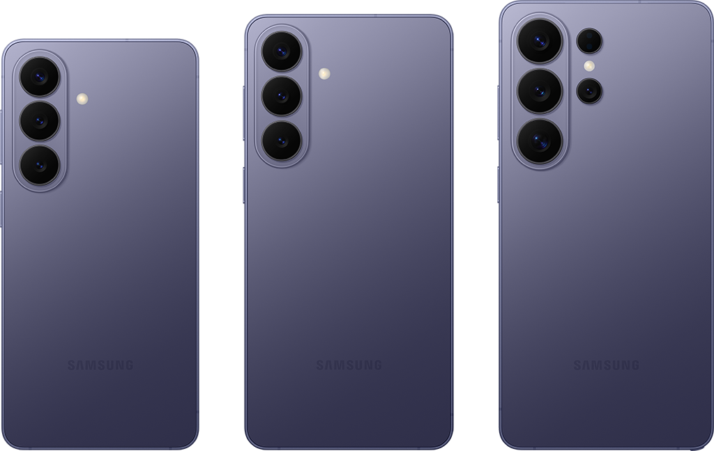
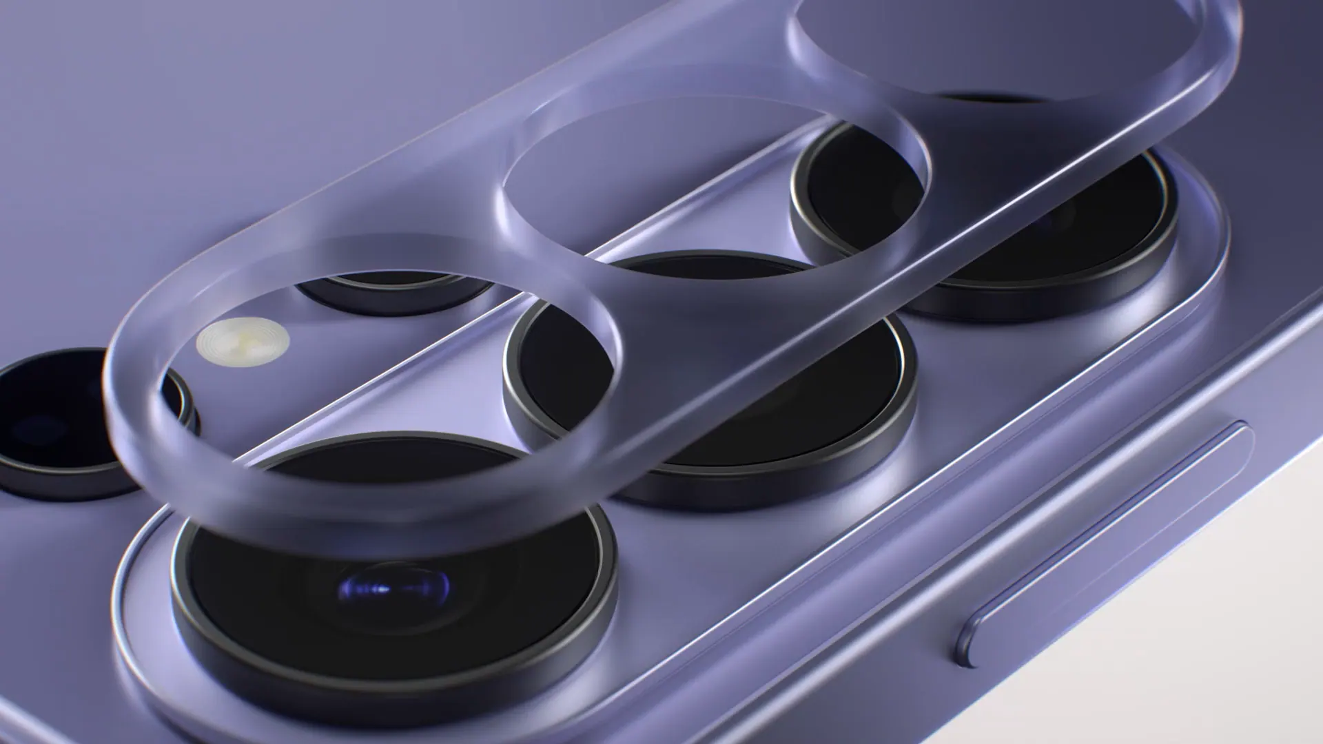
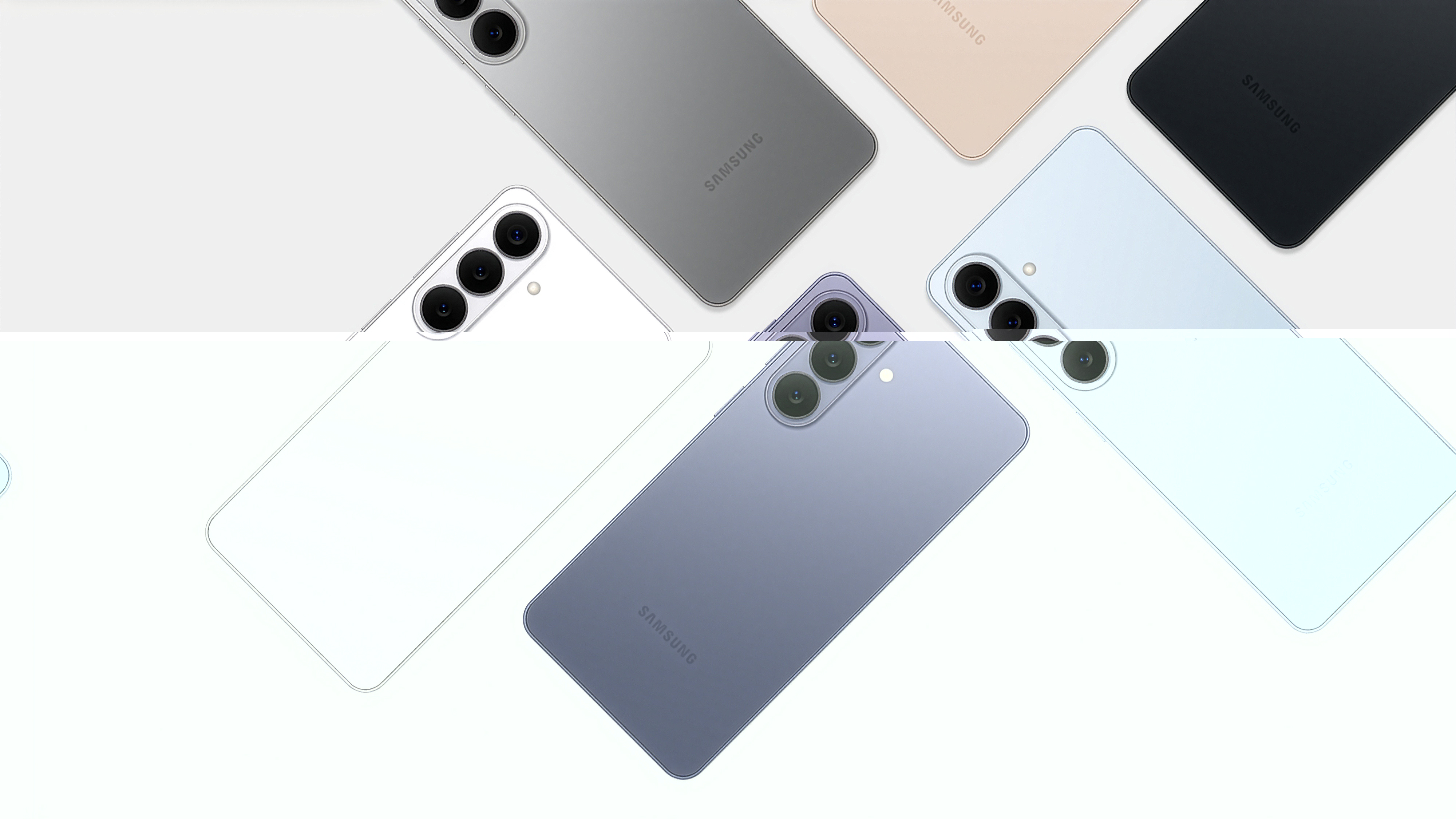
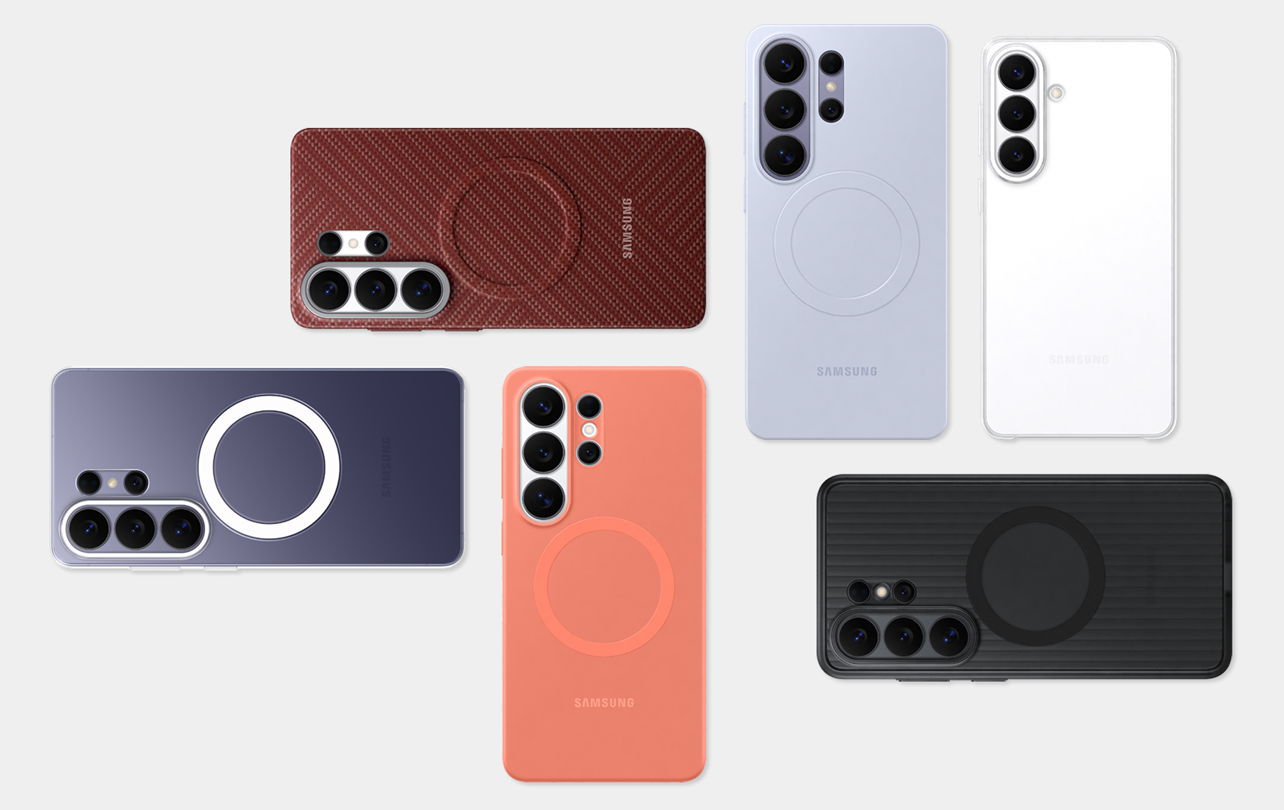
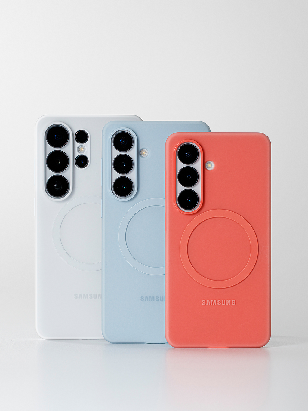
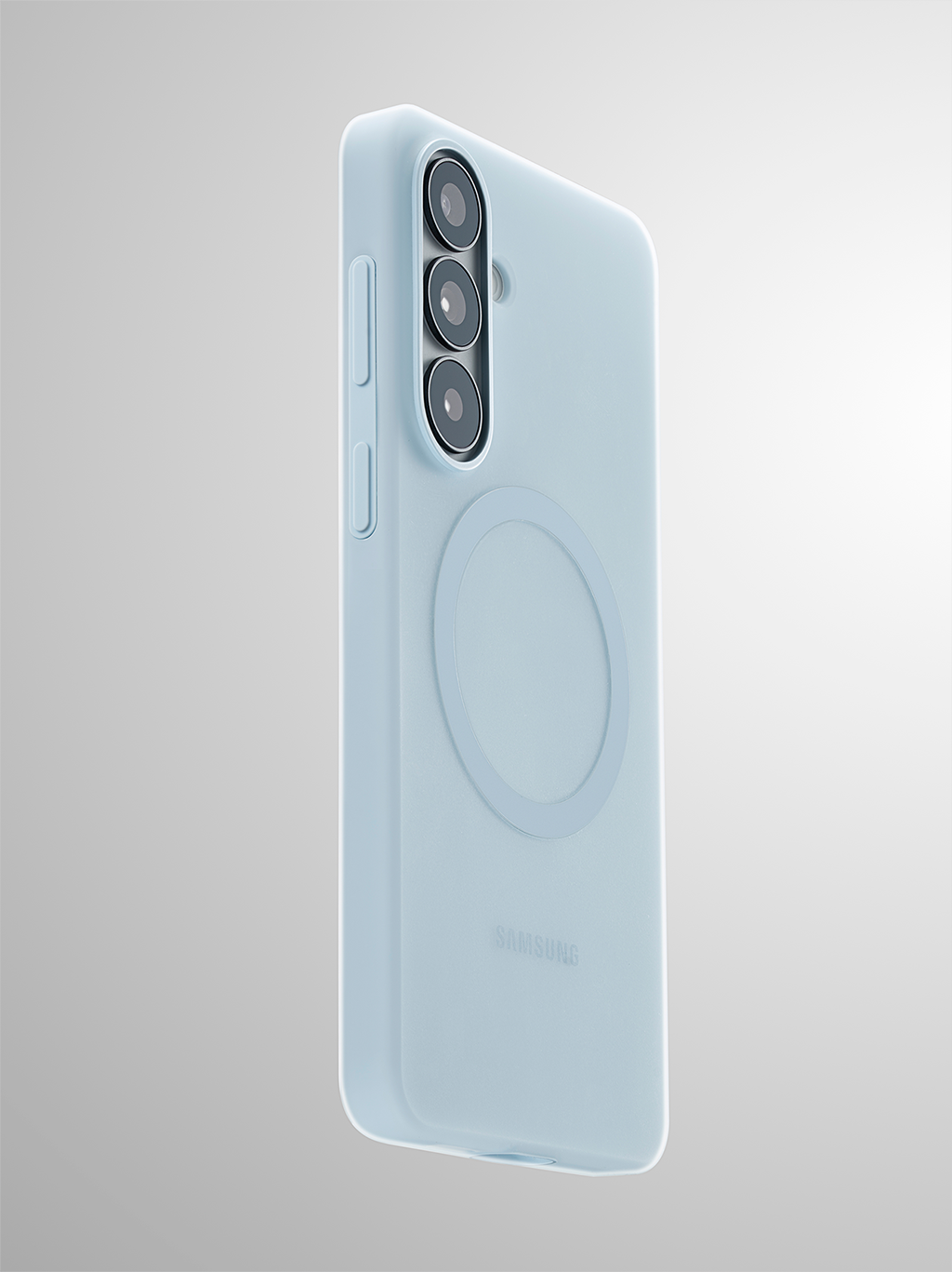
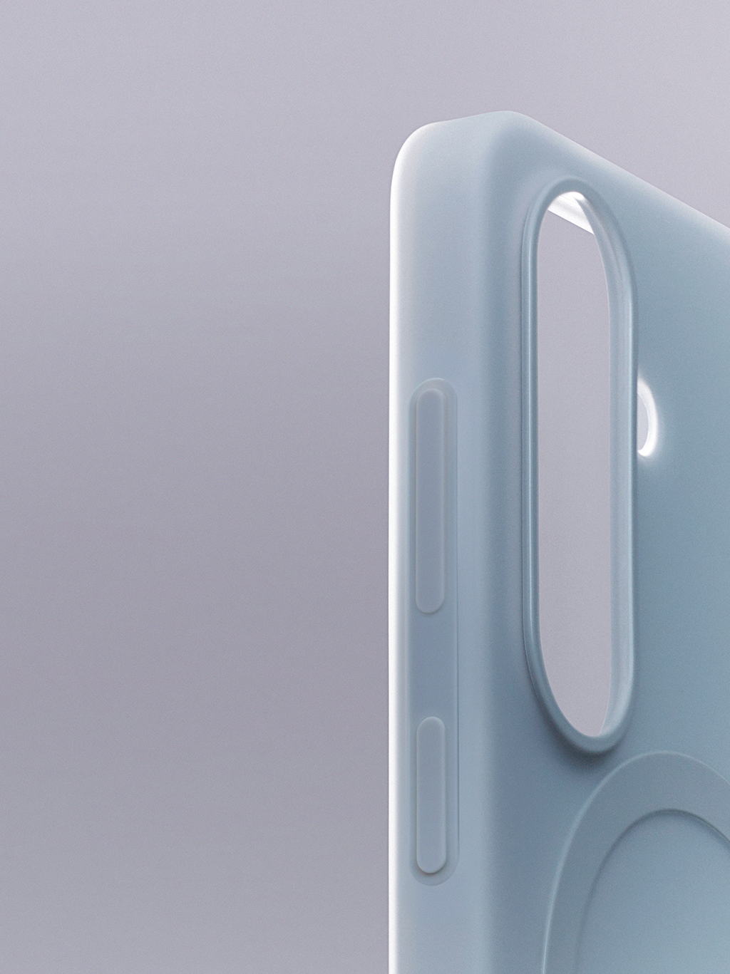
For example, with the silicone case, we refined the form to maximize the material’s inherent qualities while ensuring the camera decoration’s ambient effect flows smoothly to the front and back edges when the case is attached. We set the position and size of each opening with precision and shaped the area around the camera with a soft curve that accounts for overall back thickness, so the result feels slim, clean, and refined. Larger cutouts would make mass production easier, but we prioritized proportions and unity after assembly and pushed the finish to a higher level.

Kilhyun Baek We see case design as an extension of product design. When the engineering data changes, we share it immediately and review it together. The goal is to ensure alignment down to the smallest detail. We design cases the way a tailored garment is made. They are precisely fitted to the product and built to strengthen the product’s visual identity when it is worn.

Yoonyoung Kim Beyond protection, a case must be grounded in quality and durability. Our cases go through rigorous testing to the same standard as the product itself, and we continue to work closely with multiple teams to find the best balance across design, manufacturing, and usability. Through that process, we believe we can deliver cases that users can trust, with a design that remains genuinely desirable.

Care Shows Up in the Details

From the moment of unboxing to the last screen, the attention to detail remains consistent.

Galaxy S26 Series Packaging

What attitude and message did the package design for this series begin with?

Seonggyeong Hong Packaging is the first moment a user physically meets the product. It is not only a first impression of the device, but also a touchpoint that communicates the brand’s attitude and how we choose to approach people. That is why we continue to build within a consistent visual identity system, while evolving it each series so the key idea of the product is clear at a glance.
For this series, we saw the Ambient Island design in the camera decoration as one of the most defining design features. We responded by enlarging the graphic compared to the previous series, and shifting the viewpoint to the side so the slimmer impression comes through immediately.
We applied a debossed finish* so the brand can be experienced through touch, not only through sight. The subtle height difference in the paper allows the silhouette to feel more dimensional at the fingertips, adding depth and density to the overall unboxing experience.

*An embossing technique that applies pressure to the paper to create recessed areas in specific parts.

There have also been changes in how the packaging is structured and produced over time. What were you considering in those decisions?

Seonggyeong Hong We explored new and creative approaches to minimize ink use without compromising usability. As a result, we pared back the varied colors used in previous packaging and simplified the process to single-color printing in white. To keep color identification quick and intuitive, we moved product color information to the seal sticker, reducing printing on the box while still allowing users to distinguish colors at a glance.
With this simplified structure, the impression remains clear and decisive. It helps users recognize key product information including color, in a direct and straightforward way, while keeping the packaging experience focused on what matters most about the product.

Since 2020, the design team has been creating design films. What was the original purpose behind starting them?

Sojung Kim Communicating the intent, message, and concept behind a design is one of the roles our team considers essential. Alongside making the product, we have continually explored how that intent can reach people in a clear and meaningful way. Given the global nature of Galaxy, we felt we needed content that goes beyond a product image and can travel without being limited by language. That led us to choose film, a format that can bring sight and sound together to convey nuance more directly.
In the film, we try to capture not only the final outcomes, such as product design and CMF, but also the stories behind how those outcomes are made. Because Galaxy is closely tied to everyday lifestyle, we believed the design concept should reach users in a way that goes beyond information, something more emotional, engaging, and memorable. The design film became both the starting point for that thinking and the form it has taken today. Under the name “Design Film,” we continue to share these concepts through a wide range of external channels including social media.

How are design films created in practice, and what does the process look like?

Sojung Kim The most important starting point for a design film is the value we want to deliver through the product. From a strategic perspective, the design team aligns on what that value means and why it matters. Once that core direction is set, the process begins with planning how it should be expressed through film.
The next priority is to go beyond simply explaining the product. We focus on building a film where users can experience the value and emotion the design intends. From the visuals to the music, and through every element of direction and composition, we design the details that can move feeling. Scene by scene, we check what design should be highlighted in each moment and what kind of emotion the sound should create, refining the structure and density until the film reaches its final level of completeness.

Through design films, and design communication more broadly, what kind of relationship do you ultimately hope to build with users?

Sojung Kim As content formats and the channels people use to consume them diversify at a rapid pace, we believe design communication has to expand alongside them. That is why we do not stay only within the format of design films. We continue exploring ways to communicate design more effectively across a wider range of touchpoints. In step with shifting trends, we are also actively reviewing different technologies, including AI, to keep experimenting with new forms of freshness and appeal that feel right for the present moment.
In the end, the destination of that work is always people. We want to communicate the value of design with sincerity, while also making it engaging, so that it can build real attachment and anticipation between a person and a product. That is why we refer to this approach as End-to-End Communication. From the moment a design begins to every point where the product is experienced, we see it as one continuous flow, connected around people.
We also hope this communication leaves people feeling more excited about what comes next for Galaxy, and feeling a natural desire to own it. The message the team has long emphasized “Everything is connected in our galaxy,” reflects the same idea. Within an ongoing cycle of experiences, we will continue working to bring love and empathy for people together with the value of design, and connect them into one coherent story.

닫기