SKIP NAVIGATION
November 29, 2022

Designing
Words

Samsung UX Writing guide

This is the key visual image of Designing Words.

‘Get started’ vs. ‘Welcome!’

Picture yourself holding a brand new phone and powering it on with excitement. Most people will probably quickly skip through the introductory messages on screen, but the tiny details in the tone of a welcoming message that greets users instead of a stoic step-by-step guide might make a difference. A great first impression makes a lasting impression, just like how our moods can be lifted up when we visit restaurants and are greeted with a warm welcome instead of an unfriendly host who just says “so, what’s your order?”

All words that go into services and apps, including every explanatory message you encounter during the set-up phase, are designed by UX writers. Even the smallest expressions and simple words like “welcome” can invoke emotions like joy or disappointment in users, and that is why UX Writing plays a role just as important as graphics and interface design when it comes to overall User Experience.

Samsung Design sets a high internal standard and principles for UX Writing to provide better and useful experiences to users. This is the design story of the efforts made to finely craft the messages that our users will see as they interact with products and services.

This is the intro image of Designing Words.
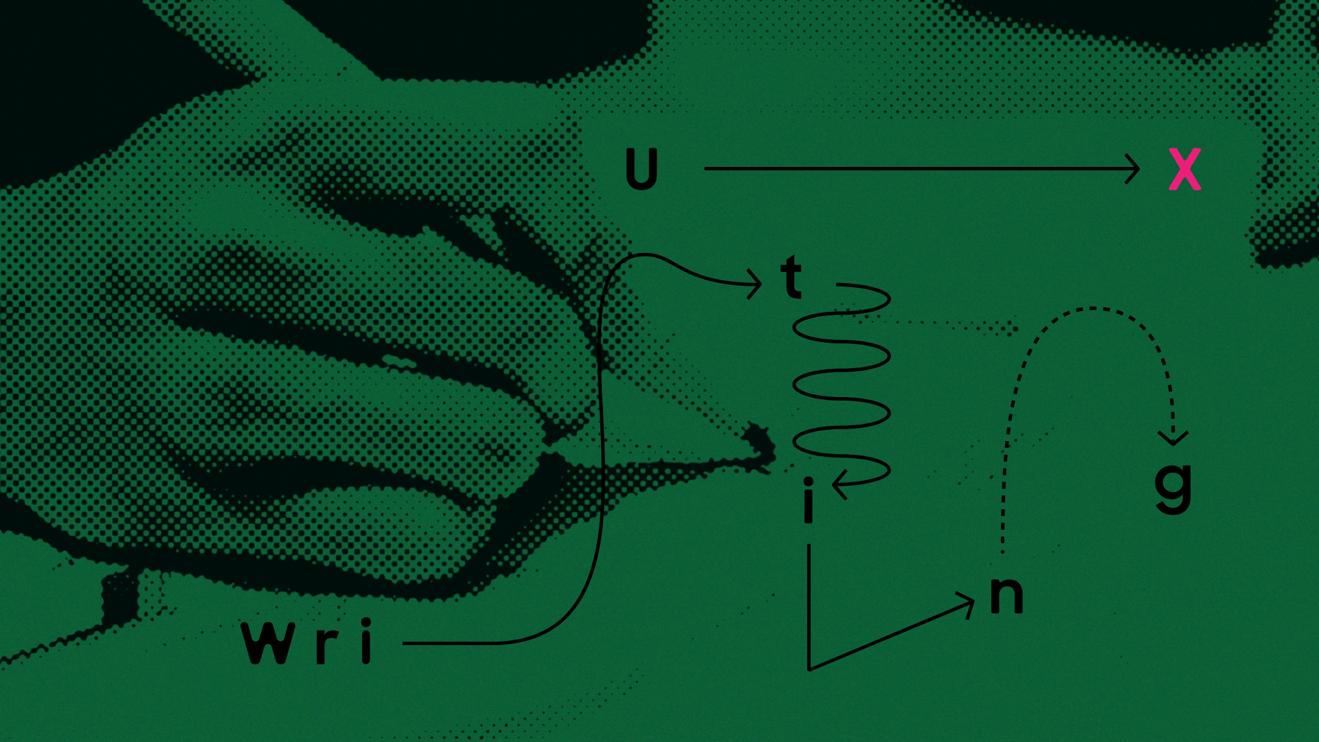
Designing Words for Users

As mentioned in the title of this article, ‘Designing Words’, UX Writing is not about writing, it’s about designing. The expression of designing words might feel a bit unfamiliar, but to put it into context, if the act of ‘writing’ focuses on producing better words, the act of ‘designing’ is to create words that are helpful to users. A well-designed UX Writing resolves the inconveniences of users and creates new values and joyful experiences as they navigate through the words they encounter.

“What kind of expressions would be helpful for our users?”

This is the question that must be asked every time for UX Writing. It’s important to think in the perspective of a user, not in the perspective of a service provider. In every and all circumstances, the user is always the hero.

Strikethrough is drawn over ‘SMART’, which is filled in the square.
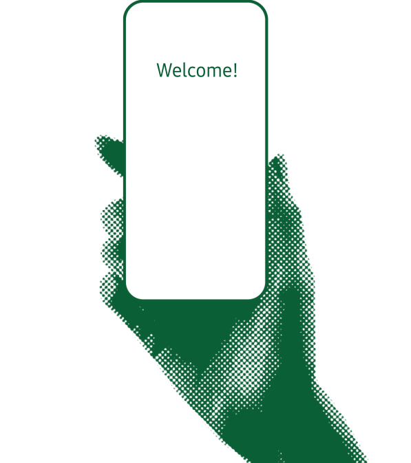
‘Useful features for Smart life’

Which feature is this text referring to? This particular text can be attached to any feature. But at the same time, it doesn’t’ contain any meaningful information. Simply adding the word ‘smart’ in front of things doesn’t make it ‘smart’. The service provider would want to use the word ‘smart’ to emphasize the specialness of the feature, but when users see it, there is a high chance they won’t find it particularly smart or special.

UX Writing is not meant to be used to promote things. If the purpose of marketing is to leave powerful impressions on users in a short burst of time, UX Writing is meant to help users effectively use the features and functions over the course of their interactions. That is why UX Writing must approach messaging differently from marketing.

It must be honest without exaggeration, and easily understood by everyone.

A display image that conveys the fact that the network is not reachable and the solution.
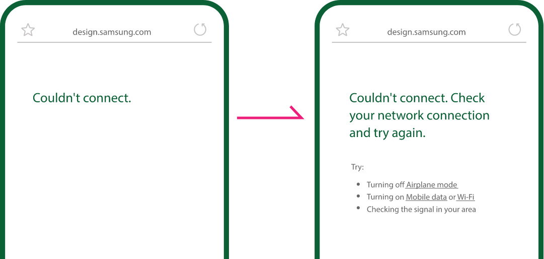
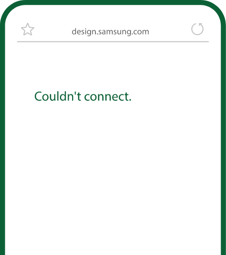
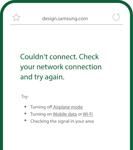
Always Be Transparent

Being honest is to be transparent in any situation. People react strongly when others are trying to hide something from them. Even when a certain information may be disadvantageous to the service provider, it must be transparently and honestly shared with users when needed. If a particular feature is not available, this fact must be transparently communicated to the user.

Using only positive expressions won’t make the service itself a positive experience. Boldly using phrases like ‘cannot do this’ won’t make the service itself look incapable. If users feel frustration from the phrase ‘Couldn’t connect’, it’s not because of the word ‘could not’, but it’s because of the fact that there isn’t a solution to the problem. It’s important to clearly convey what is possible and what is not, and at the same time a way to helpfully resolve or workaround the incapability.

Positive experiences begin from clear communication. UX Writing’s purpose is to help users clearly understand the situation.

This is an image with the words 'Protocol', 'API', and 'OCR'.
It is Not a Thesis Paper.

The words on the left are rarely used in everyday life and probably unfamiliar to most people. UX Writing is not like writing a thesis paper. It must look for words and phrases that are common to the mass. Each year, there are countless new features introduced to our lives. The role of UX is to help users get familiar with these features and quickly adapt to them. Terms like Wi-Fi and Bluetooth that were once industry term can now be used comfortably as they’ve been integrated into users’ daily lives, but anytime there is a word that describes new technology must be thoroughly examined before being introduced to users through UX.

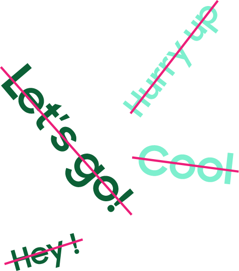
Being User-Friendly does not mean you are friends.

Should we then use friendly expressions like ‘hurry up’ or ‘let’s go’? That’s not the right approach either. A user-friendly UX Writing does not mean the language should be colloquial enough to sound like a close friend talking to you, but it’s meant to clearly and simply convey facts and truths of the product and feature to help us get acquainted better.

When communicating on information regarding smartphone security, a casual phrase like “this feature will make you safe” may sound friendly but it also lacks in credibility. A more succinct and factual phrase like “this is a feature that will reinforce the security of the device” gives a more trustworthy and secure feeling to the user.

Being ‘friendly’ is to maintain a fine line of professional friendliness that has a both helpful and approachable tone.

Strikethrough is drawn over “Let's go!”, “Hey!”, “Cool”, and “Hurry up”
This is the image of a gender checklist with the entry “Prefer not to say”.
Considering All Users

The term ‘black list’ was frequently used by people. But words like these can be discriminating, and should no longer be part of everyday language. When choosing words and phrases, we must be careful to identify words that contain metaphorical connotations that are discriminating or offensive, but must always strive to use neutral expressions.

When inputting personal information to register as a member, we’re asked for information on gender. It’s easy to overlook the fact that the only available options are male and female, when we are living in world where diversity and inclusion matters. Just choosing between male and female may not be a simple choice for others. Additional options like ‘Enter your gender’ or ‘Prefer not to say’ are little details that consider the needs of all users.

We are living in a new world that is more diverse than ever. A great UX must be dedicated to all users without discrimination.

This is the outro image of Designing Words.
“Keep it simple!
Keep it honest!”

UX Writing was more accommodating to the PC environment before the prevalence of mobile devices. For instance, a phrase like “Are you sure you want to delete these files?” relates more to PC users, whereas a mobile environment UX would simply ask “Delete these files?” These two phrases differ greatly in terms of length and tone. This change is of course due to the differences in screen size, but it can also be attributed to the sentiment of today’s user who would feel a bit awkward when the device asks if you “are sure you want to” do something. (Think of the lines in old movies sounding a bit awkward to today’s audience.)

As the times change, so does language and expression. UX Writing must also adapt and evolve with these changes. To do that, the most important thing is to make the utmost effort to understand and grow closer to the user.

Written by the Samsung MX UX Team

닫기