SKIP NAVIGATION

One Way,
Your Way


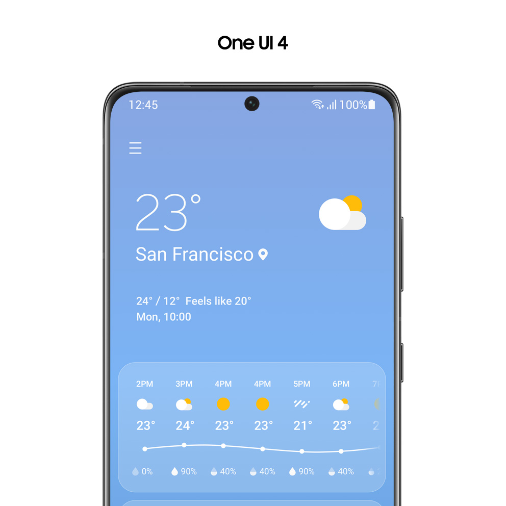
Close to Your Everyday Life, One UI 4

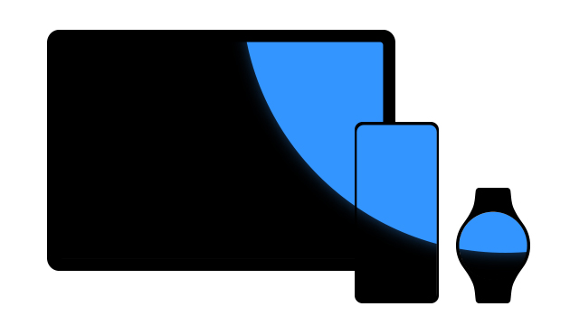
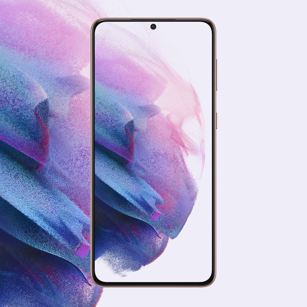
This is the key visual image of One Way, Your Way contents.
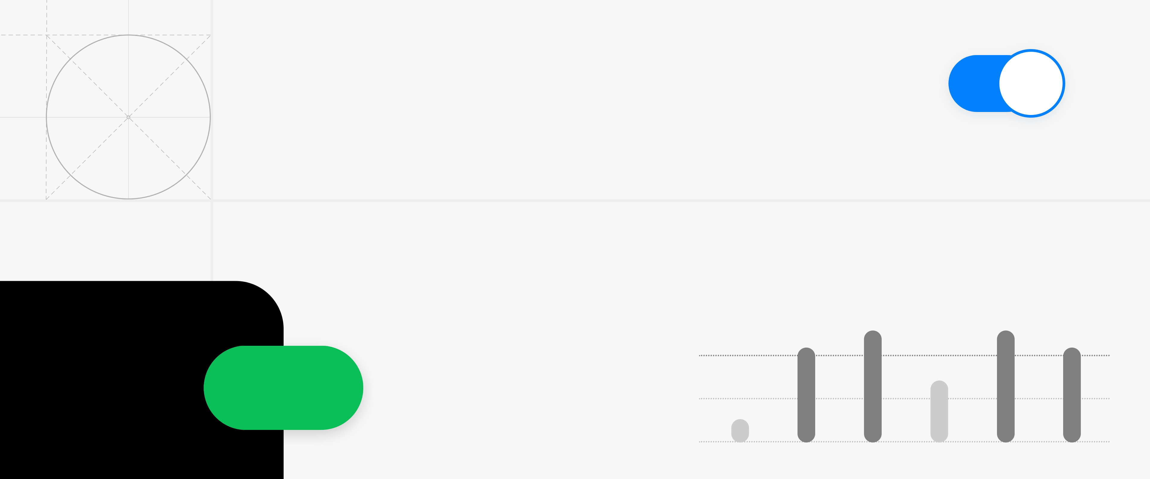
One UI 4 seamlessly connects and expands the touchpoint of user lives based on insights into the complex and segmented lifestyles of today's users to provide a smart device experience that is perfectly tailored to their needs. The clean visuals and orderly structure smoothly harmonize with any experience or story, and the delicate yet flexible elements of the interface help users freely express their individuality and abilities. It keeps everyday life convenient and secure in response to various situations, and leads to a better experience that elevates the user’s lifestyle to a new level by expanding possibilities.

* The images shown are for illustration purposes only and may differ from the actual product. Product specifications may vary by country, region, model, and carrier.

The society and environment we belong to is constantly changing. With this change, users desire more complex and diverse experiences. In today’s world, there is also a constant influx of innovative products based on advanced technologies that change our everyday lives.

In the midst of all this change, One UI will always listen to the voices of customers and continue to evolve so that our users can comfortably and joyfully experience their everyday lives. Yoojin Hong, Head of UX Team for Samsung Electronics Mobile eXperience Business

Focus On
What Matters

This is an image that graphically expresses Samsung Health, Samsung Wallet, and Calendar. This is an image that graphically expresses Samsung Health, Samsung Wallet, and Calendar.

The essence stands out more clearly and distinctly when unnecessary aspects are removed. One UI 4 constantly asks itself what is most important and simplifies its form to better convey the interface. The information hierarchy and visuals are neatly organized for the most important elements to be quickly understood in a single glance.

It is an image in which a green round square and a red round square are arranged side by side.

A Simple,
Coordinated
Color

It is an image in which a green round square and a red round square are arranged side by side.

One UI 4 arranges colors and text so the information can be intuitively understood. A more concise color system and meticulously adjusted font size and thickness deliver a clearer and more consistent impression. Usability is enhanced by emphasizing the distinct functional role of color, such as red indicating warnings and deletion while green indicates positivity like connections and startup.

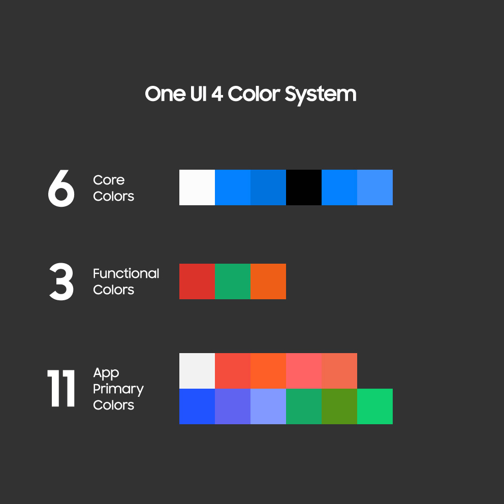
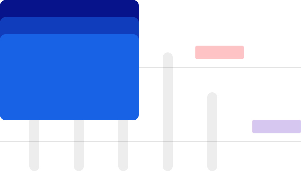
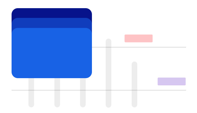
This is the color system image of One UI 3 and One UI 4.

What was the reason for the color system re-organization and which part of the task did you focus on?

The keyword for this color system re-organization is ‘Clean-up’. The task was carried out with colors being applied to the most important information first, while the less important information was made monotone. As a result of this refining process, the flow of information can be naturally recognized when using the device. Users can focus more on important information with visual comfort and no distraction.

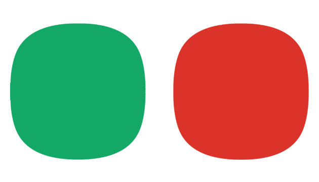
This is the image before and after unification centered on red and green color.

There was also a task of unifying functional colors with similar meanings centered on red and green. What was the process like?

Red usually indicates the notions of Stop, Delete, Remove, Reject, or Decrease. Before One UI 4, the colors of components with similar meanings were slightly different. We focused on unifying the color with one kind of red for users to clearly understand the context of each function. Additionally, the brightness and saturation were slightly increased to enhance visibility more than before while unifying red and green into one color. There was a process of multiple discussions with each app designer regarding functional colors, since they are commonly applied to various apps. There are also several conditions that must be met, such as the 3:1 brightness contrast ratio that must be observed from an accessibility perspective. The final color was completed through considering and adjusting these diverse conditions numerous times.

This is an image before and after Text Rearrangement and boldness.

It seems that the font was tidied up all around through letter spacing and boldface type.

Considering the increase in time spent on mobile devices due to the pandemic, our focus was on providing ‘Effortless Comfort’ when organizing information. The presentation of information was made more prominent than before by adjusting the visual contrast based on the priority of information. An optimal Negative Space was completed by altering the dynamics of font size and thickness according to the importance of content. As a result, users can feel comfortable when using the device for a long time and quickly understand the information they need by pinpointing.

This is an image that graphically expresses Samsung Health, Samsung Wallet, and Calendar.

Reducing
Visual Noise
and Distractions

This is an image that graphically expresses Samsung Health, Samsung Wallet, and Calendar.

Apps that notify the weather, schedule, or health information are used often throughout the day. One UI 4 has altered the design for better visibility and management of information. Information is classified in layers and boldly removes visual obstructions to help users more vividly recognize it. Emotional aspects were also carefully considered by adding wit to the process.

This is the image before and after changing the design of the weather screen.

The overall Weather app has been replaced with a clean, stylish look along with a new weather icon.

Important information varies from user to user. The current weather is important to some people, while the changes in the weather throughout the day are more important to others. This information was previously mixed in the upper main card, but displayed separately as ‘current weather’ and ‘today’s weather’ on the One UI 4. The essential data, current temperature, location, and weather icon, were created with stylish visuals and placed at the top to enhance readability. Today’s weather for each time zone was then arranged in a card form below to neatly organize the entire layout. A graph was added to facilitate intuitively understanding weather changes during the day. Additionally, the previous ‘more’ button on each card was assessed to be unnecessary and was boldly removed to complete a more concise impression.

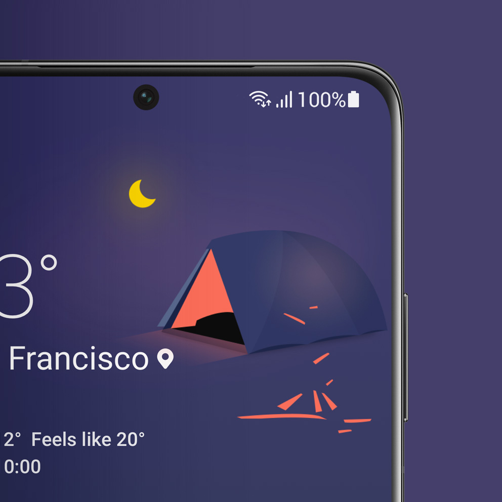
This is an illustration image video that appears on the weather screen.

In addition to the visibility, interesting illustrations are standing out. How was this fun element created?

The One UI 4 Weather app has been modified for the newly changed weather icon to stand out. Designers gathered ideas to add new and witty elements that are uncommon in standard weather apps to emphasize this area. As a result, illustrations were added.
We also thought about the smooth transition from weather icons to illustrations. The idea of cracking an egg or a thermometer turning into ice cream emerged during the process of reflecting various ways of best expressing the intention of each illustration. Additionally, we tried to fully implement realistic movements into illustrations with natural objects such as fruits, plants, and birds as motifs.

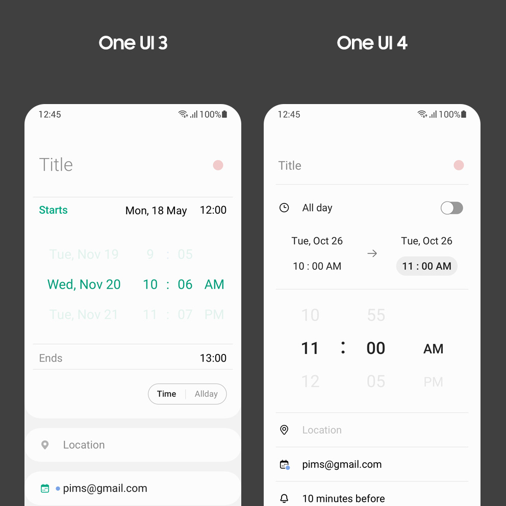
This is the image before and after the calendar screen design changed.

The Calendar app has also been organized to easily see the date and schedule. It must have not been easy to implement a basic yet sophisticated look. Which part of the design did you focus on?

A screen without a schedule was designed not to look awkward based on data that most users register one to three schedules a day. Paying attention to key information such as the month, day, and schedule was made possible by replacing the previous gray background to a clear white. The text is centered for a stable layout, and horizontal lines were added for a clear view of information sorted by week. A function that allows easy event registration by simply entering a subject, as if sending a quick message, has been added to the bottom of the Calendar app. Time does not need to be registered separately since it is automatically recognized when written in the title, allowing a more efficient use of the app.
The color behind the text was also adjusted to an overall soft tone when registering an event. It is harmonious even with multiple colors on one screen, reducing visual fatigue in Dark Mode.

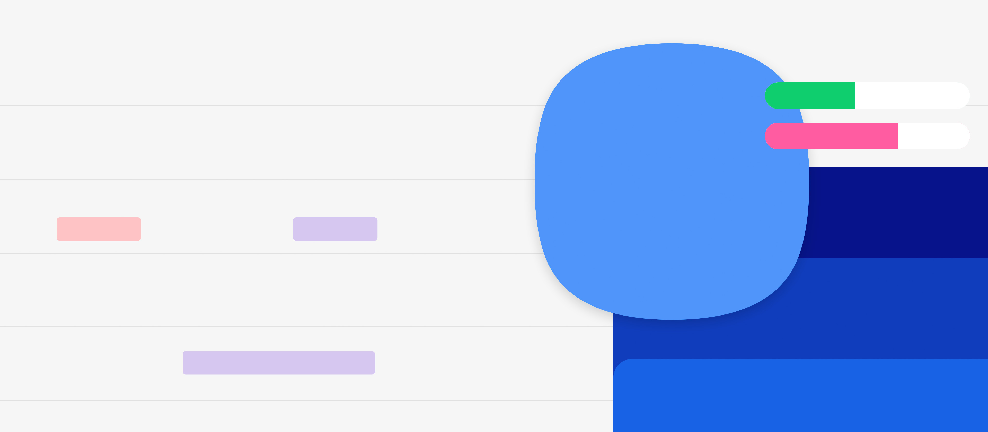
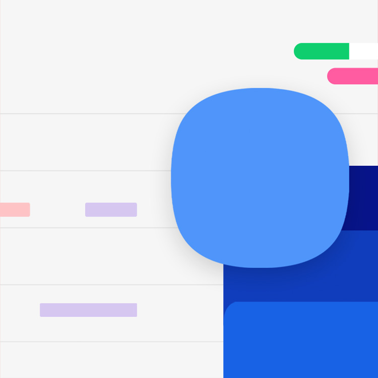
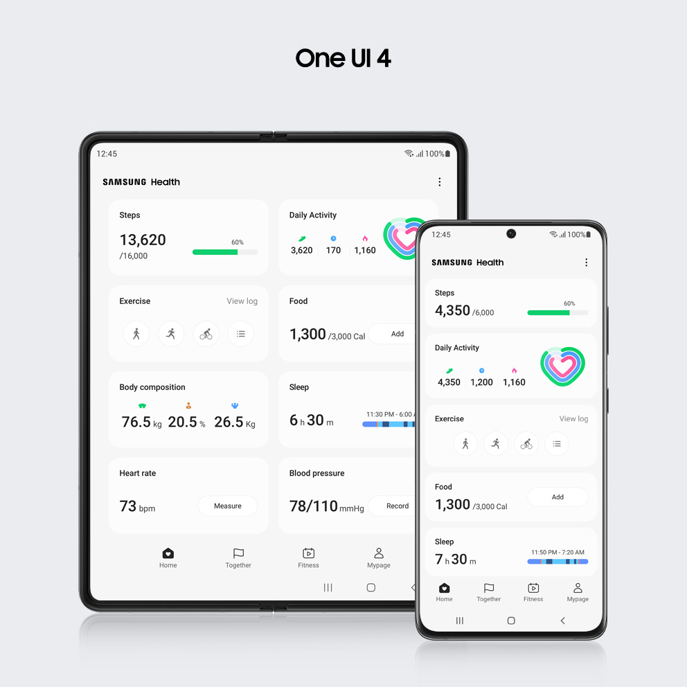
This is the image before and after the Samsung Health Screen design changed.

The Samsung Health is an app that displays various health information. Since there is so much content, it must have been difficult to classify the hierarchy of information. What criteria did you work on?

There are various indicators for health and exercise data, and their unique characteristics are clear. There is always a conflict when deciding whether a common basis will be effective or a separate basis will be necessary for the way information is presented. Information is prioritized according to its characteristic and a strong visual contrast to the dominant indicator is provided. After minimizing the expression of the remaining low-priority information, the information hierarchy is reviewed for any issues. When additional information is needed, the designers continued to discuss and verify whether it should all be shown at once or if simplifying is possible.

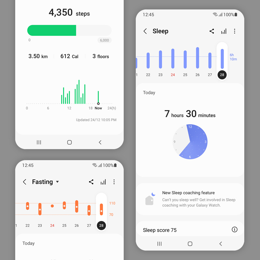
This is Samsung Health Graph image.

What kind of efforts were made to effectively arrange various figures, such as graphs and text, without looking complicated?

Samsung Health contains three main types of functions. A bar type is simple when range, progress, or status information is important, such as number of steps, heart rate, stress, or blood sugar level. Information such as food intake, sleep state, or water consumption is expressed as a symbol type since cumulative data is more important than progress. There is a text-only type that displays text without a graph in other cases when recognizing the number itself is important.
The importance of information is shown by the difference in text size, and colors are minimized to clearly deliver data except graphics such as symbols and charts. This design system becomes an important standard for designing a consistent visual for various Samsung products, such as Galaxy Fold and Galaxy Tab.

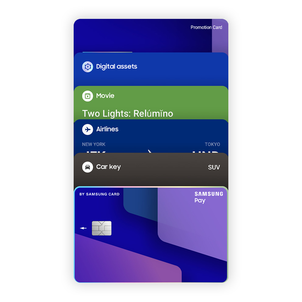
This is Samsung Wallet image.

Delivering concise and accurate information seems crucial for the newly introduced Samsung Wallet since it contains important user data, such as credit cards and photo IDs. What did you mainly consider?

We tried to create a design that shows users the data they need at the right moment by observing situations when Samsung Wallet is used. The Quick Access tab, the first screen of Samsung Wallet, is divided into a stacked view and expanded view. A clearer visual component was needed for the unfolded form since the space that exposes each card information was reduced. For example, since card information is shown by a 35% ratio within overlapping cards, the logo is placed on the upper left corner while the text displaying card properties is placed on the upper right. Information with similar characteristics on each card detail page was grouped together for an easy search, while functions and information with different features such as usage history and tasks running were separated visually.
We concentrated on the visual interaction when scrolling to provide users a pleasant experience in terms of both functional and emotional aspects. Although every card simply moved at once in the initial part of design, a parallax scroll effect was the final decision for the cards after prototyping with feedback from various departments.

Helping You
Stay
Comfortable

It's a graphic image of a privacy indicator and a permission dashboard. It's a graphic image of a privacy indicator and a permission dashboard.

As more time is spent on smart devices, there are more things to bear in mind such as security or health. One UI 4 values the importance of people using smart devices safely and comfortably anytime, anywhere without worries or inconvenience.

It is a graphic image that expresses a privacy indicator.

Privacy
at a Glance

It is a graphic image that expresses a privacy indicator.

It is natural for users to feel anxious about having their personal information leaked through their smart devices. One UI 4 has implemented various functions to protect users with higher standards for security and privacy. It reduces anxiety by immediately notifying users when the camera or microphone is active and provides details on where sensitive information is being used.

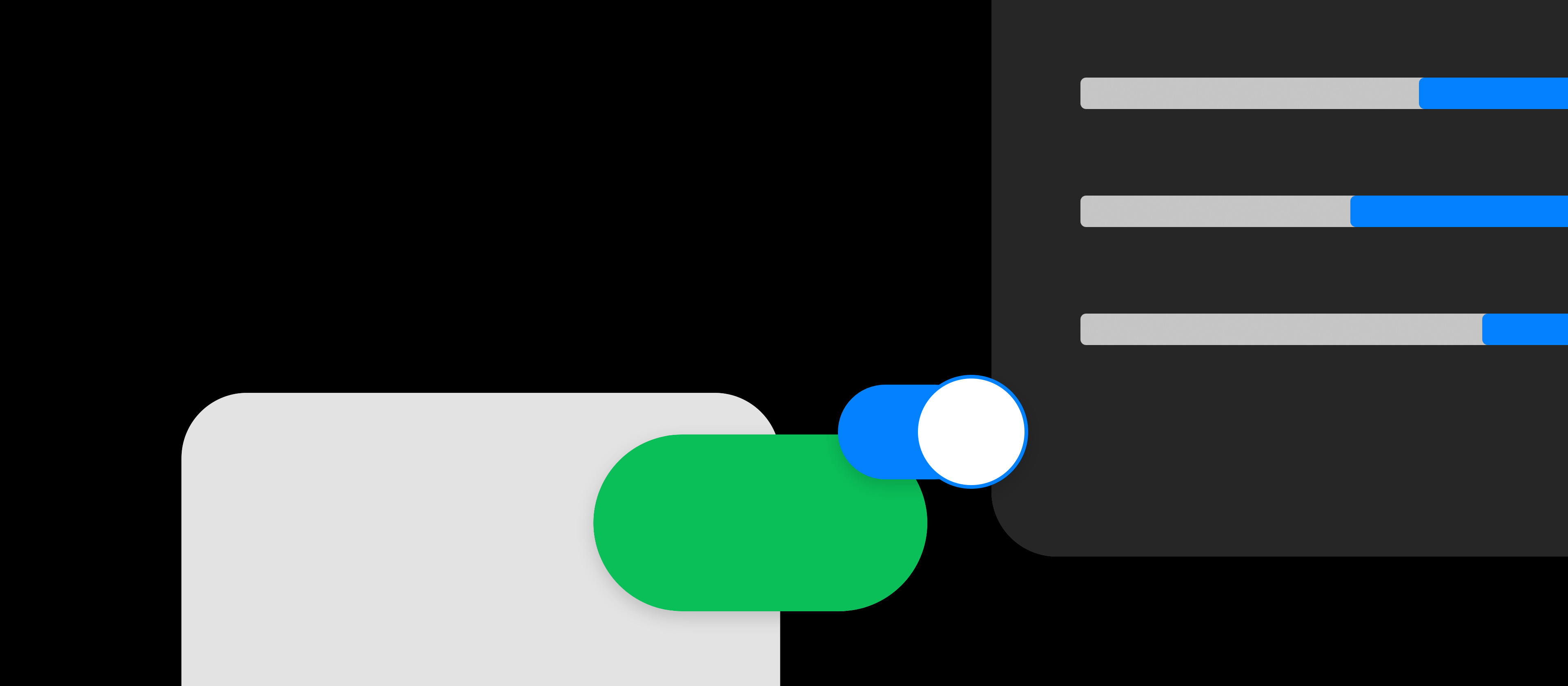
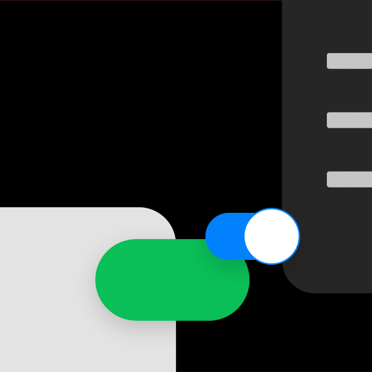
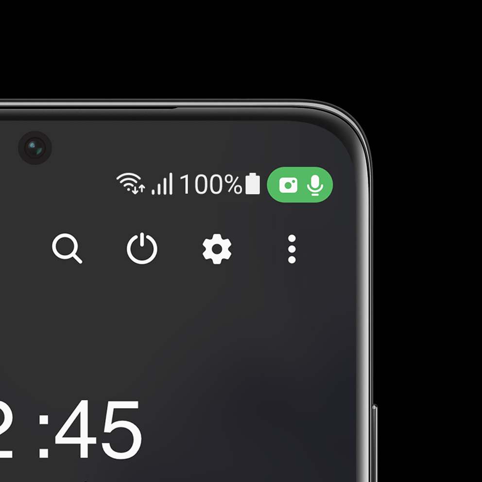
This is the privacy indicator image.

Users can check when the camera or microphone is turned on with an icon on top. What was the context behind the addition of these features?

User interest in privacy and security has increased significantly in recent years. We applied the same newly added function to the Android 12 OS with full empathy for these user interests. It is a tool that detects whether a specific app or function steals personal information or infringes privacy through a microphone or camera without user consent. The user can immediately recognize this and take action if it is not desired.

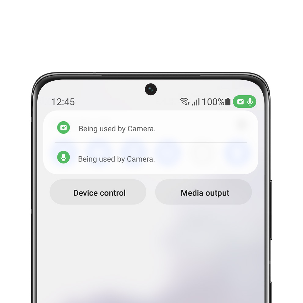
This is a pop-up image that appears when you press the privacy indicator.

How did users react?

The green icon on the top is not a warning. It indicates that the device monitors every use of camera and microphone to secure your privacy. Users can use their device with confidence after experiencing that the function operates correctly several times. There were opinions that icons constantly appearing was excessive at the initial part of design, but positive reactions have been seen in media and tech reviews after the release of One UI 4.

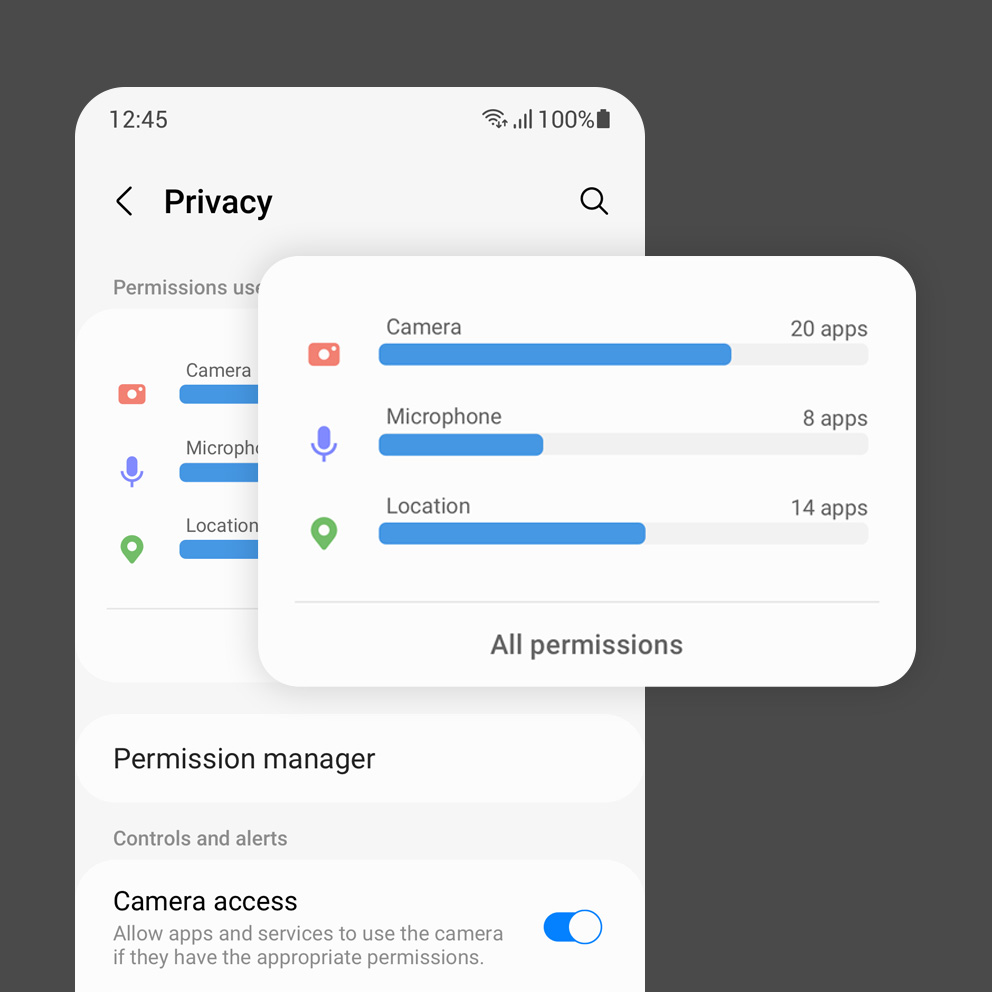
This is the permission dashboard image.

The Permission Dashboard transparently shows where and how many times camera, microphone, and location data has been used. Which part did you focus on?

Sensitive information refers to various sensor data such as microphones and cameras, along with personal data like location. Malicious apps that access and exploit various sensors and data after gaining permission for personal information have recently become a problem. The Permission Dashboard can check and block apps that request unnecessary permission for sensitive information even while the app is inactive. We focused on simple phrases and a friendly, flexible design to straightforwardly demonstrate the difficult concept of permission for device information.

It is an image that expresses various smart devices graphically.

Stay Comfortable
Every Time

It is an image that expresses various smart devices graphically.

Every detail was carefully examined to help users conveniently use their smart devices in any circumstance. Dark Mode, which lowers visual stimuli, not just darkens the screen but reduces visual fatigue by utilizing meticulous details. Additionally, consistent visual design has been applied to various form factors to provide comfortable usability even when used across multiple devices.

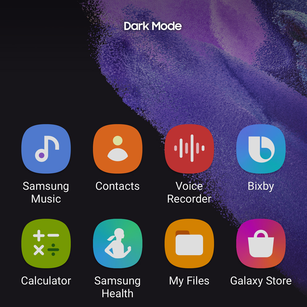
This is a screen image that switches to dark mode.

How does Dark Mode provide comfort to users?

Dark Mode reduces strain in the eyes caused by bright light when the device is used in a dark environment, providing a comfortable experience even after prolonged use. Most users will have experienced lowering the device light in bed before going to sleep at least once. By reducing the area known as white metaphor, Dark Mode is also useful for people who have low vision or sensitive to bright light. It can also be used for content immersion as it enhances attention on images and videos.

It is an image that expresses the dark concentration in dark mode.

How were the design details come together for Dark Mode?

We tried to find an appropriate level of darkness to enhance visual comfort without compromising the aesthetics and striking features of the app icon. Various color tests were conducted to reflect the illuminance and usage environment. As a result, we determined the current darkness level that naturally and uniformly tones down the entire app icon color, prevents glare from white metaphors, and satisfies the visual balance between home screen elements.

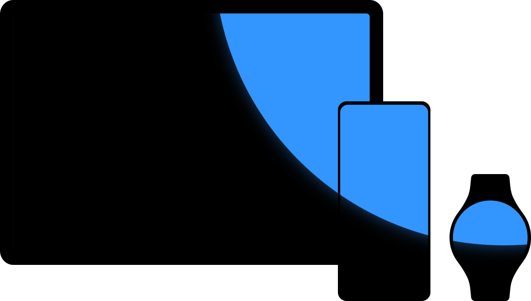
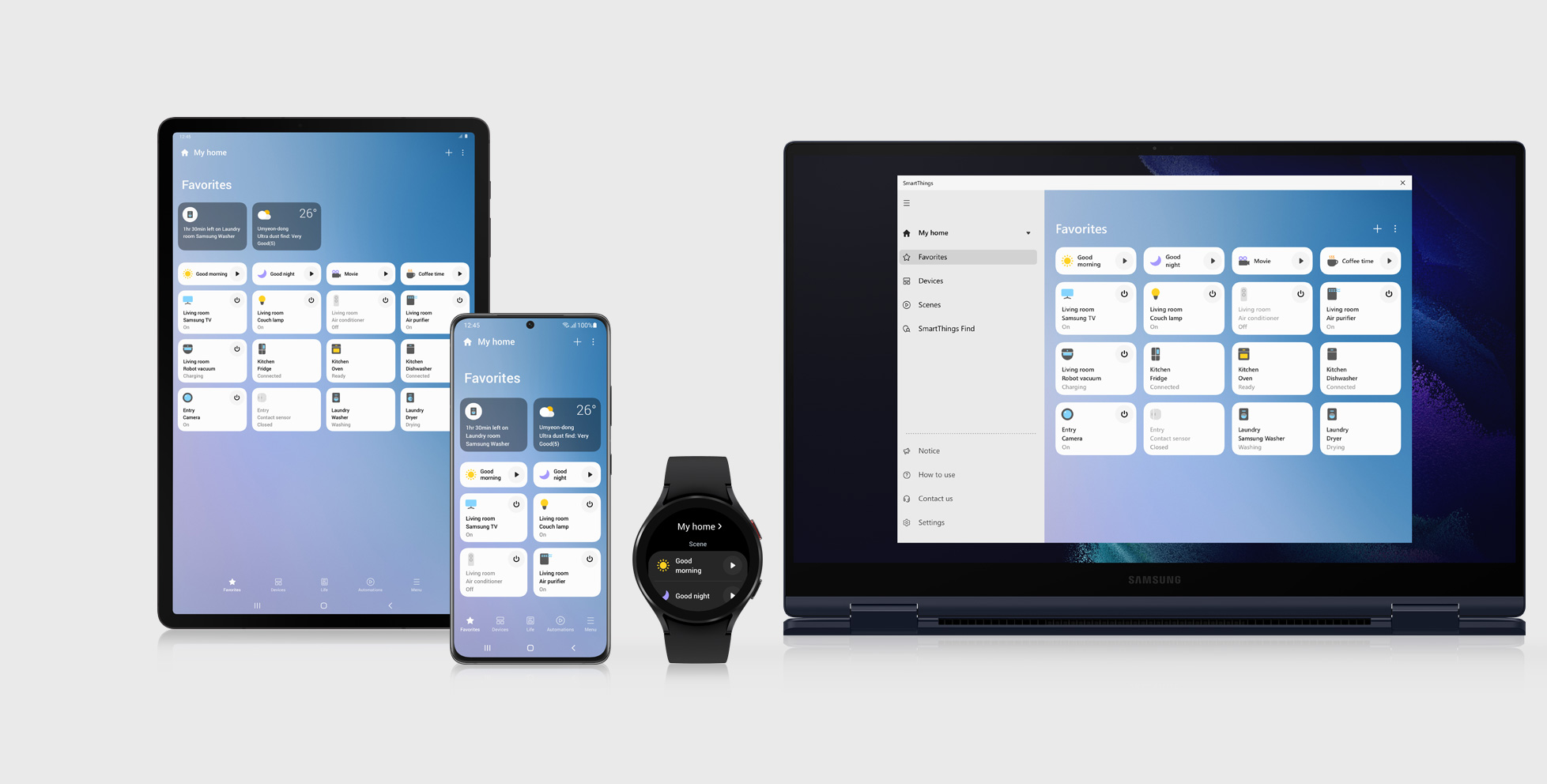
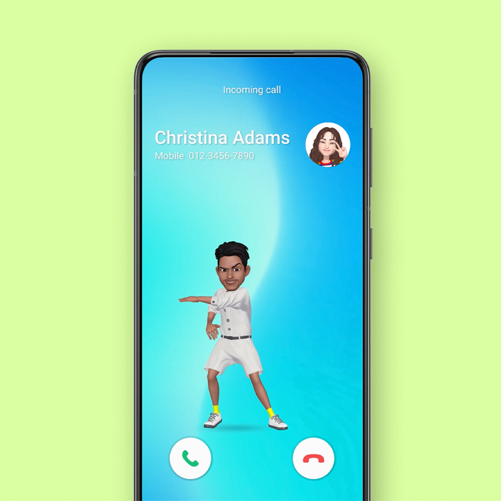
It is an image with one visual language applied to various devices.

What do you focus on to ensure that various Samsung devices can be smoothly and comfortably used together or individually?

One UI 4 applies a single visual language to various products such as smartphones, tablets, smartwatches, and PCs. Devices can be used comfortably through unified elements such as icons, rounded corners, components, menu style, layout, etc. even when changed. One UI 4 also provides a natural and seamless experience when connecting or switching between various devices. For example, data stored in the Samsung Notes is automatically linked to other devices, allowing the user to use their PC or tablet to continue working on notes and sketches made on the smartphone. One UI 4 delivers an efficient user experience, such as using the tablet as the main screen while the smartphone is used as a work pad.

Empowering You
to Express

It's a graphic image of a watch face and widget. It's a graphic image of a watch face and widget.

Smart devices have become a tool for expressing one’s emotions and individuality for today’s users. One UI 4 expands the range of choices and changes for every user to use them according to their lives and tastes. It permeates deeply into lifestyles and helps users expand their experiences in their own ways.

It is an image that expresses a color palette graphically.

My Personal
One UI

It is an image that expresses a color palette graphically.

Device features become more noticeable with wallpapers created according to the characteristics of various devices. The Color Palette function changes the visual theme of the device based on the wallpaper selected by the user. This function helps users who wish to decorate the same device in their own way to fully reveal their individuality and taste.

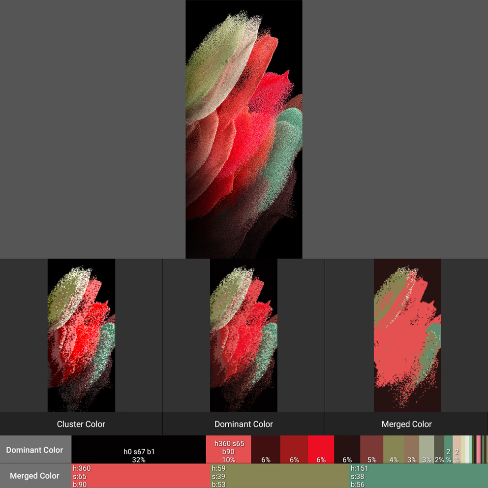
It's a variety of wall paper particle images.

How did the wallpaper’s ‘Particle’ concept come about? And what factors were considered when applying this concept to the wallpaper?

We conducted research on design elements that can be freely expressed while being applied to various products. We discovered the potential and scalability of the ‘Particle’ material and established the slogan ‘From Micro to Macro. Flexible & Limitless Expression’ which the design was based on.
Wallpaper design should reflect various aspects, such as the product’s hardware and software features, its usability, and how it will be communicated in the market. Each product should be able to reveal its typical characteristic, such as the symbolism of Galaxy S representing the series, the innovation and desirability of Galaxy Z, and the large screen of the Galaxy Tab and Book.

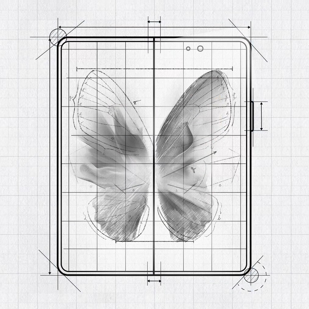
This is a wallpaper image applied to the Galaxy Z Fold.

How has the wallpaper design of each product developed within the same Particle concept?

Taking the Galaxy Z as an example, we started with the basic keyword ‘Folding’. We were inspired by folding art when thinking of an implicit message the product will contain while presenting its foldable structure. Folding art reduces the volume through consolidating and enhances solidity by folding thin and fragile materials. We believed the versatility, strength, continuity, and expandability of this type of art represented Galaxy Z Fold’s characteristics. The Galaxy Z Flip was also designed in a similar context but proceeded in the direction of highlighting a more fashionable and unique product image.
For large-screen products such as the Galaxy Tab and Book, a design that emphasizes the scale of large screens along with power consumption issues from prolonged use was considered simultaneously.

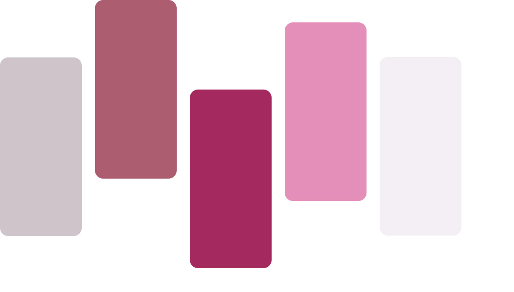
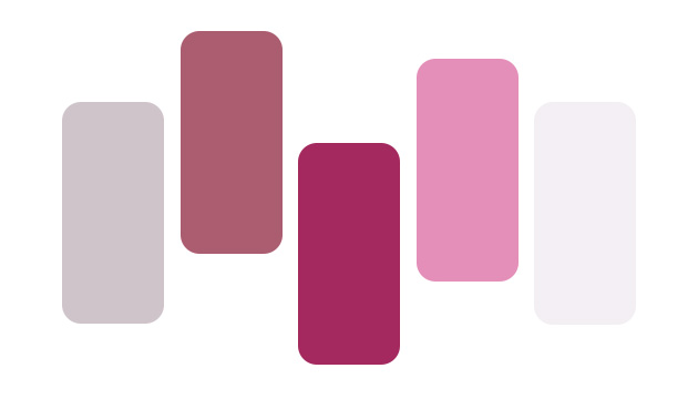
It's a color palette prototype image.

The Color Palette extracts five colors from the wallpaper and changes the visual theme of the device. What was the process of implementing this?

The color palette is a function that internalizes Android 12 Material You – Dynamic Color based on One UI. It uses five colors extracted from wallpapers to support Google and other apps.
During the project, we contemplated on how to extract the five colors and where to apply them. We came to collaborate with designers who are researching the method to extract color from an image while reviewing various research results. We were able to discover the optimal color extraction method while testing various images by analyzing the original image, dividing color groups, and supporting a prototype that recognizes the distribution of extracted color.

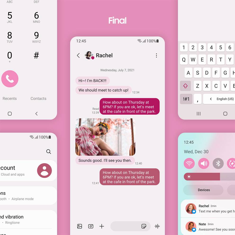
This is a screen image with color applied.

The colors have become calmer compared to the colorfulness in the initial process. What was the context of this?

At the beginning of the project, we aimed to apply the colors extracted from the wallpaper in a noticeable way. However, in accordance with the value pursued by One UI 4, the design was revised to convey the overall mood of the wallpaper for users to focus on and comfortably view the content. In the final version, the background color saturation was lower than it was initially, and the buttons were adjusted for colors to stand out without straining the eyes.

It is an image that expresses emoji pairs graphically.

Express
All You’ve Got

It is an image that expresses emoji pairs graphically.

The way of expressing emotions becomes richer and more enjoyable in One UI 4. The new Emoji Pair feature allows you to cleverly express your emotions by combining two emojis and adding fun animations. The AR Emoji is more natural and features exciting movements, revealing the users’ virtual selves to the fullest by utilizing their personality.

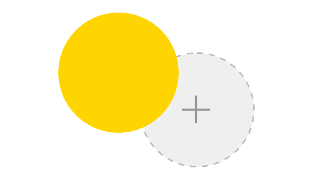
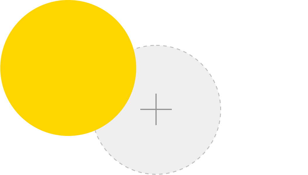
It's a video showing emoji pairs.

The Emoji Pair, which expresses two different emojis in various animations, is fresh and entertaining.

Emojis expressing complex emotions such as ‘sad-laugh’ and ‘laughing but not laughing’ never existed before. The need for these complex emotions was confirmed by interviewing various users. After several idea meetings, the Emoji Pair was born. We tried to make the most of the keyboard emoji that Samsung already had and create a richer and more entertaining expression by adding animations. As a result, more than 20,000 different emoji pairs can be created by adding animations to the combination of two emojis.

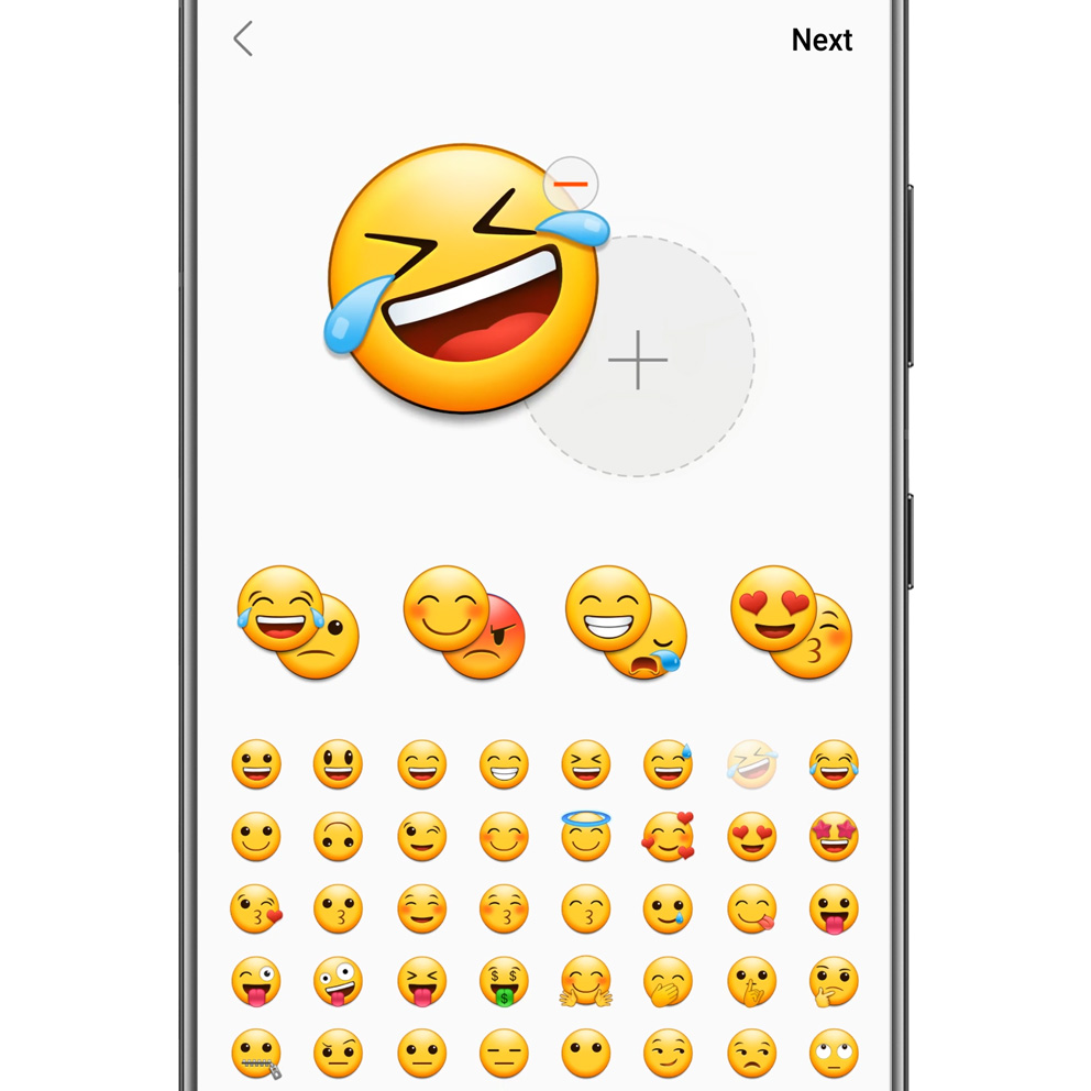
It's an image that shows the emoji pair.

How did the concept develop from the initial idea?

It began with a small idea of having ‘hidden emotions’. At first, we thought of the feature in which hidden emotions appear when interacting with an emoji, or a hidden message is revealed when the emoji is turned over. We needed to materialize these concepts according to keyboard features and implement them in the interface. We considered the method of long-pressing then drag and dropping the emoji, but there was a limit to preloading over a thousand emojis. The concept was realized by allowing users to choose two from the selected emojis and having the first emoji serving as a cue to the following paired emoji.

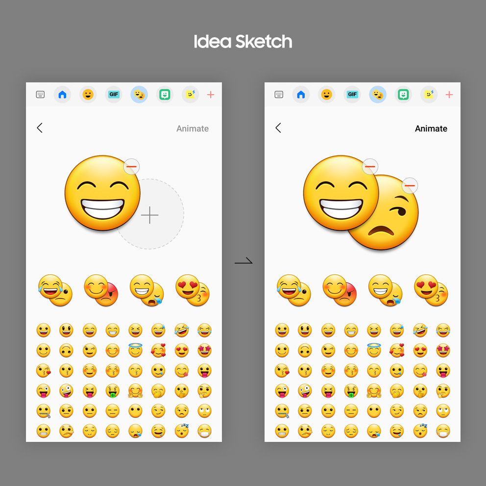
This video shows examples of various emoji pairs.

The concept has been expanded from ambivalence to complex emotions. What was the reason?

We tried to create animations that express emotions in various styles to bring life to emoji combinations. When the first concept was ambivalence, we reviewed the situation where Emoji Pair was used while creating animation ideas. We decided that the situation of combining emojis with similar emotions without opposition should also be considered, since forcing the user to create emoji combinations is impossible. That’s why the scope of the concept has been expanded from ambivalence to complex emotions. Animations suitable for conflicting emoji combinations along with amplifying emotional expressions with similar emoji combinations have been produced.

It's a video that shows AR emoji.

The sophisticated movement of AR Emoji and witty gestures catch the eye. How are these motions made?

We try to stay up to date on the latest trends in dance moves and motion through various channels such as social media. Simple movements and expressions are carefully worked by animators one at a time using the key frame method. More complex motions, such as dance, are produced with motion capture in a professional studio. They also collaborate with famous artists to create high-quality motions such as professional dance moves.

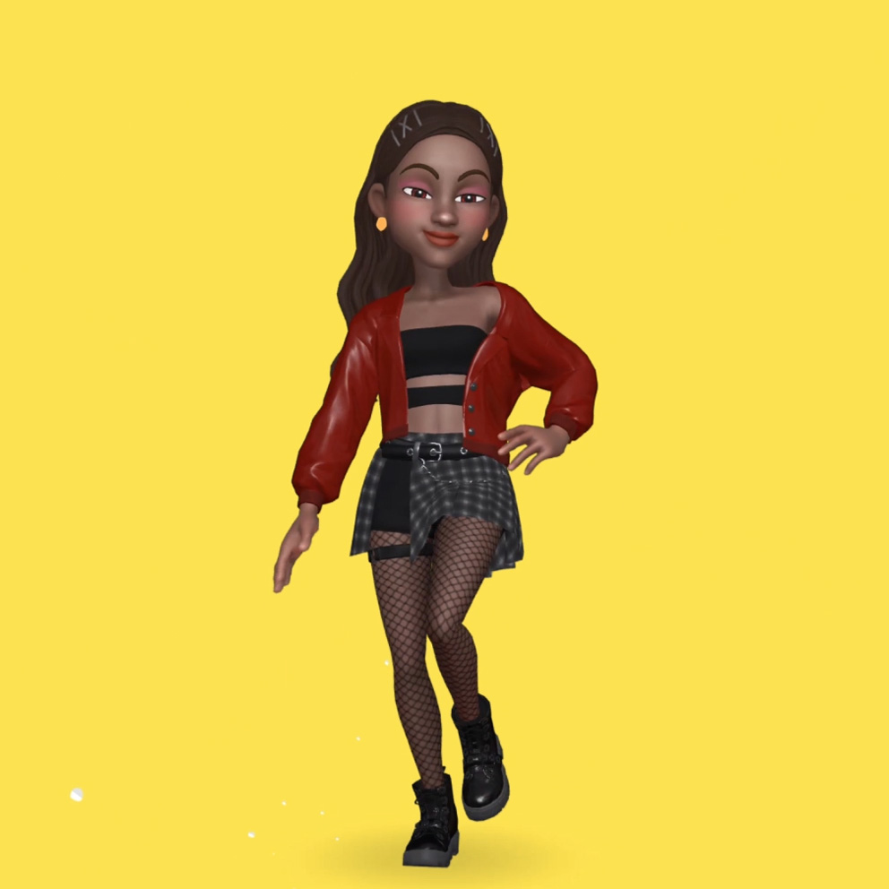
It's an image that shows AR emoji.

How do the preferred AR Emoji stickers differ by country or age?

AR Emoji stickers were produced from votes on sticker motion preferences in four countries: South Korea, Brazil, the United States, and the United Kingdom. There was no significant difference in overall performance among the countries, but there was a slight difference in the age groups. People in their twenties preferred more caricature and exaggerated stickers than those in their thirties. Most users wish to give a funny and pleasant impression rather than being serious when using stickers. I wanted to exaggerate laughter when laughing and not be too serious when sad.
The reasons for choosing the preferred motions also slightly varied by country. ‘Because it was fun’ was chosen the most in South Korea and Brazil, while ‘because it best expressed my feelings’ was said the most in the US and UK.

It’s a video AR emoji dancing.

Is there a new type of AR Emoji you would like to create as a challenge in the future?

We want to create a more simplified avatar or a new style that does not resemble a person, such as animals or robots. We believe it would be fun if AR Emoji appeared in a virtual reality, chatting with colleagues through emojis, joking around, and bragging my fashion sense.

It is an image that expresses the shape of a widget graphically.

Close
to Your Heart

It is an image that expresses the shape of a widget graphically.

One UI 4 expands the experience by providing various options for users to use the device they desire. Users can customize their smartwatch to fit their tastes and lifestyles through a variety of distinctive watch faces. Additionally, various widgets are offered in a unified visual identity to enhance the joy and usability of decorating the home screen.

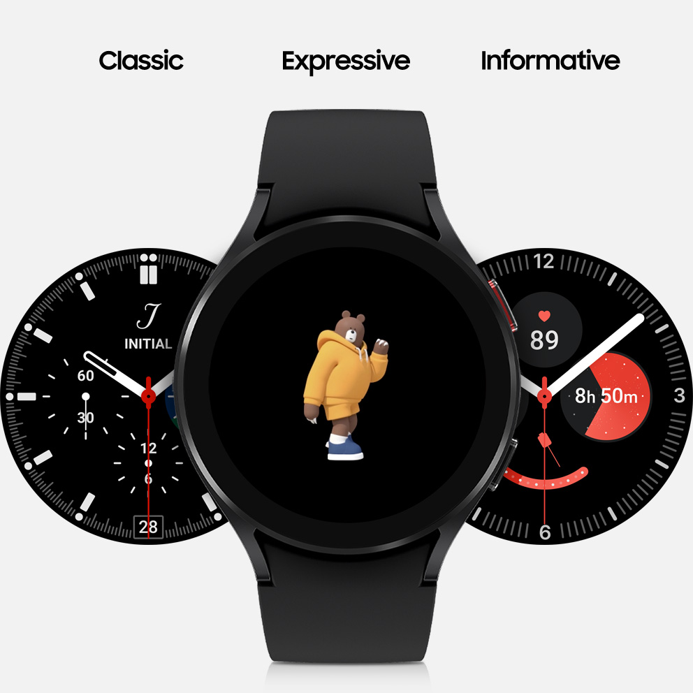
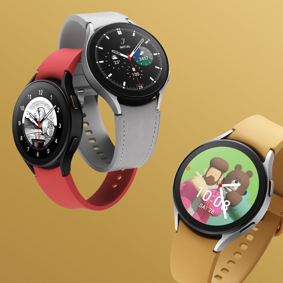
This is a character screen video applied to the Galaxy Watch.

The Galaxy Watch has offered numerous watch faces so far. Which part of One UI 4 did you focus on?

The watch face is divided into three types: Classic, Informative, and Expressive. The Classic has a traditional composition, the Informative focuses on performing active functions, and the Expressive boldly expresses individuality. When the Galaxy Watch 4 was released, it focused on expanding the spectrum of the Expressive type. We completed a three-dimensional lineup by adding characters of various styles to the watch face, such as a vegetable character for a healthy diet or a bear character for challenges.

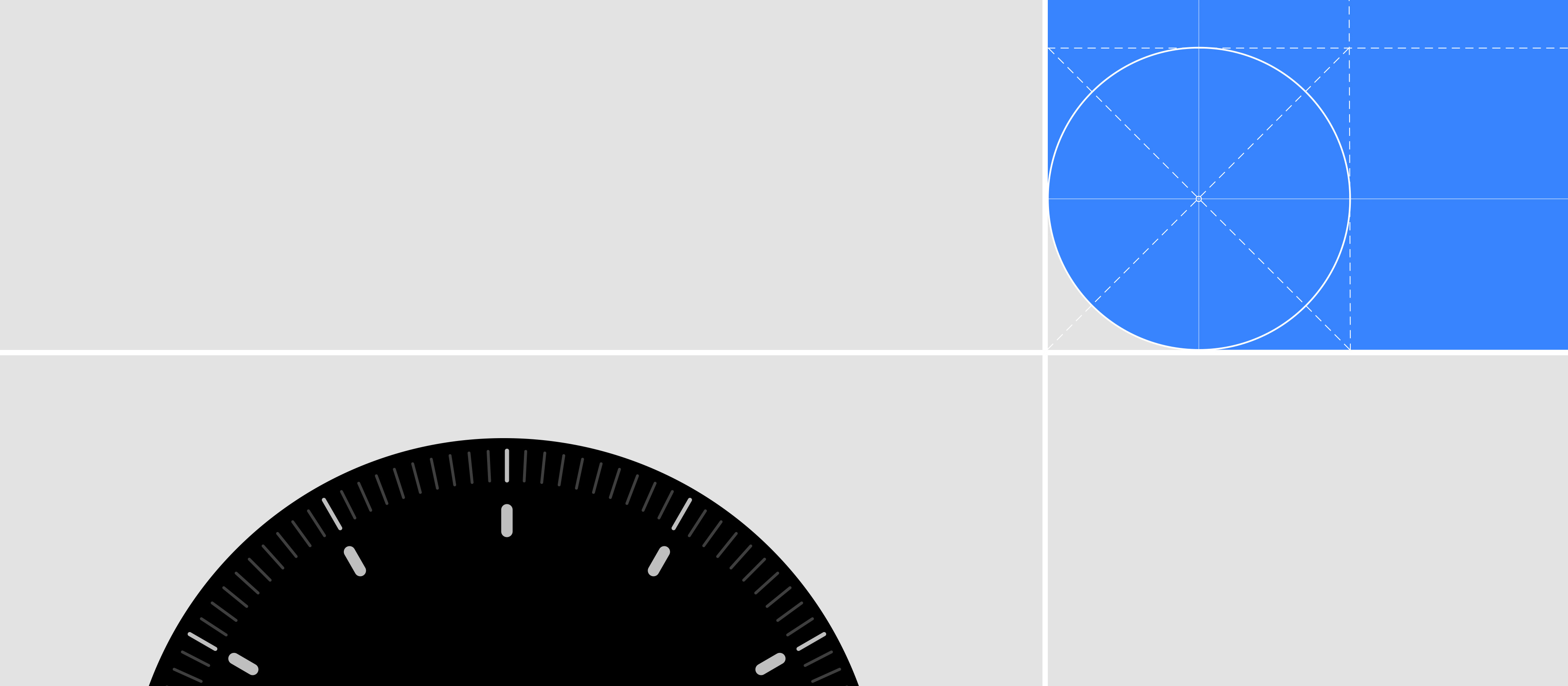
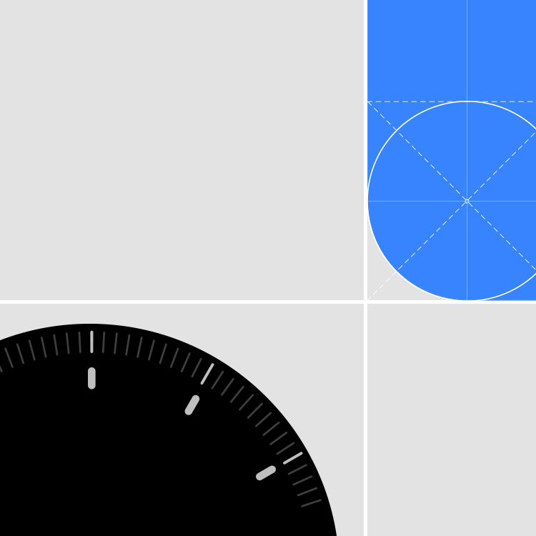
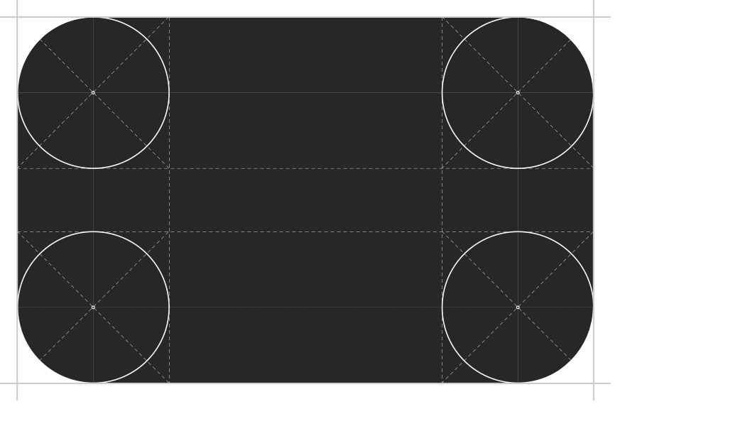
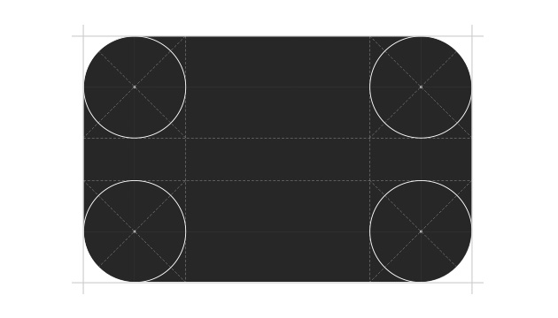
This is the image of the Galaxy Watch design system.

What are some standards or systems you refer to when designing various watch faces?

The design system was built by referring to the types and designs of Indexes, Hands, and Sub Dials of real analog watches for consistency between the watch faces. The color of the strap and surroundings were selected as the primary color to blend with the Galaxy Watch strap, and the remaining colors were made based on the international color system.

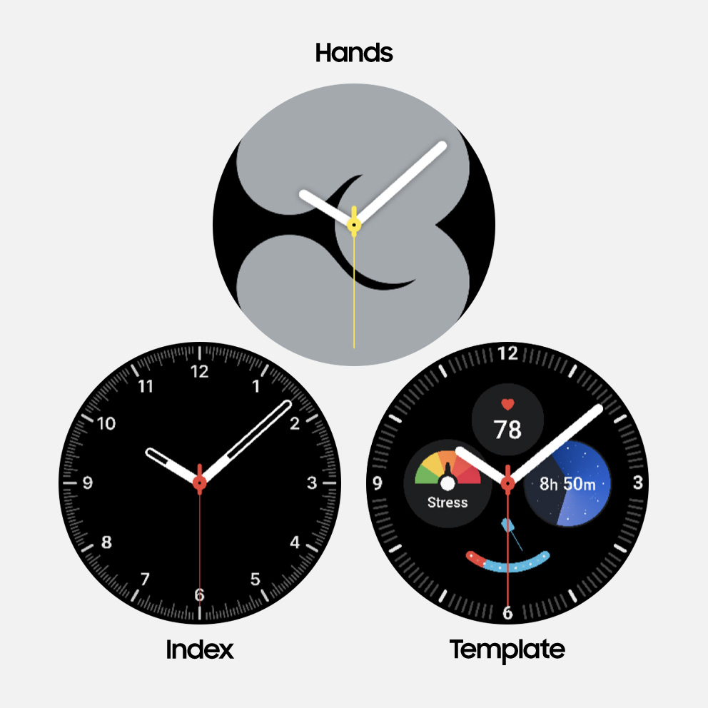
This is a character screen video applied to the classic watch face.

Please share some behind-the-scenes stories on designing watch faces.

The classic watch face was derived from the characteristics of an analog watch. Particularly, the Premium analog watch face can be customized with one’s initials where the logo is usually placed on top of the watch. The watch face that uses 3D characters is receiving positive responses from users by providing fun animations based on certain situations, such as low-battery notifications or when music is playing. The extinct animals watch face with the engraving style illustration was improved by discussing details with artists.

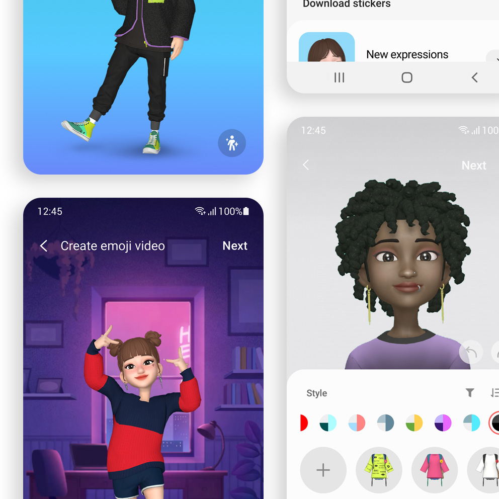
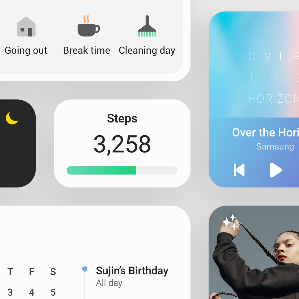
This is an image that shows various widgets.

One UI 4 widget gives a neat impression overall. Which part did you focus on?

After continuous consultation and effort, changing the widget shape collectively within Android became possible. The One UI visual language was applied to both Samsung and third-party widgets to enhance visual perfection. We concentrated on making the overall feel appear minimal while utilizing style elements to strengthen the visual identity of Samsung widgets. Work was carried on in way that strikes a balance between complex elements and simple designs.
The area is not wide compared to the information provided by the widget. It was designed to provide visual contrast for information to be seen at a glance while focusing more on what needs to be emphasized. The minimalism was maximized and content immersion was enhanced by changing the background color 100% white.

This is the outro image of One Way, Your Way contents.

With more devices and experiences to fill our lives than ever before, it has become increasingly important to perceive the trends of today. Samsung designers never cease to carefully listen to the voices of users, comprehending their signals, and relentlessly exploring the experiences they most desire. One UI deliberates around the variables of diverse circumstances and situations to help users easily and comfortably take full advantage of their devices in ways that best suit their personalities and tastes, regardless of time or place.

Go to samsung.com
닫기