Visual language can be interpreted as a social act.
It must have traditional elements of communication, as well as an expression of identity.
Samsung Mobile’s new visual language communicates with users through a unique
expression while maintaining familiar visual communication cues.
01. RESEARCH
-
REFINED
-
PROGRESSIVE
Harmonious Collaboration of
Vision and the Legacy of Design
New design doesn’t appear out of the blue. It is born in the creative mix of new values
perpetuated by changing trends and the thorough understanding of the legacy of design.
We aspired to develop a balanced visual language that combines existing ‘Refined’ styles
of Samsung Mobile design and the all-new Galaxy S8’s ‘Progressive’ style.
Extensive research in the fields of design, art, and passion were conducted, and various
case studies were examined to germinate the seeds of inspiration for this project.
02. DEVELOPMENT
Visual Language
for Seamless Experience
Design for the Galaxy S8 was first conceived based on the idea of providing
a perfect interaction between physical and digital space. The product’s physical
details inspired the visual language we were developing, and our challenge was
to impart a unique identity to the Samsung Mobile device while staying
in the same wavelength of contemporary trends.
Continuous
The identity of a product is not determined solely
by its external design. The most important factor is
a natural connection between the first impression of
a product design and the iconography system that is
continuously displayed on screen.

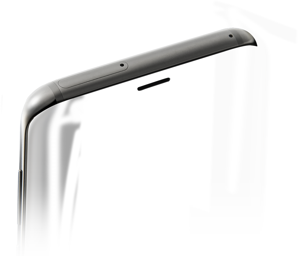
We analyzed the elegant and stylish
shape of the Galaxy S8 and developed
a new iconography system that was
inspired by the rounded treatment
of the Galaxy S8’s curves.
Light & Line
With the proliferation of visual experiences, more and more user interfaces
that contain these experiences are becoming flat. However, the user
interaction between a product and interface is not flat, but three-dimensional.
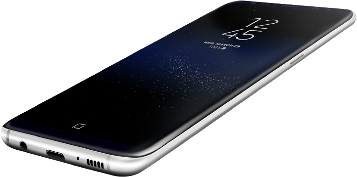
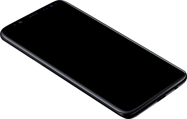
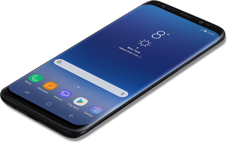
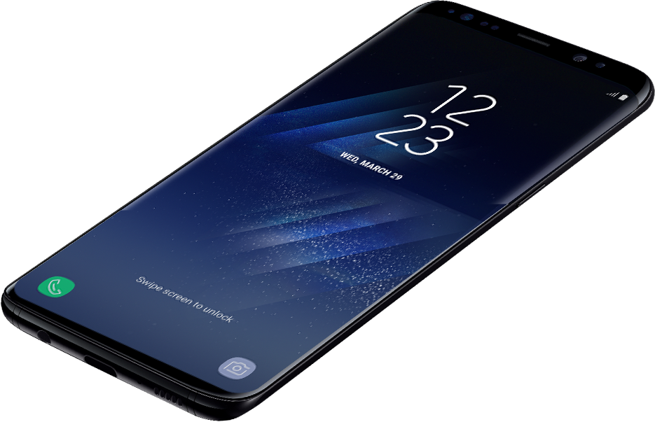
The Galaxy S8’s crucial navigational keys such as the Home, Back, and Recent
keys are placed inside of the screen to offer new experiences, but we also
had to secure familiar experiences for the user.
We first molded the Home button in a block shape and imagined visual
elements of a light shining from within and a Line that is formed from a shadow.

We discovered that the line formed on the side that emits light doesn’t
connect well with the shadow on the surface. We eventually clipped a portion
of the line to create a flat but with an appearance of three-dimensionality.
This newly designed, unique iconography now serves as a bridge between
hardware and software.


Own-able Shape &
Meaningful Colors
90
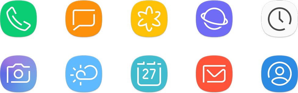
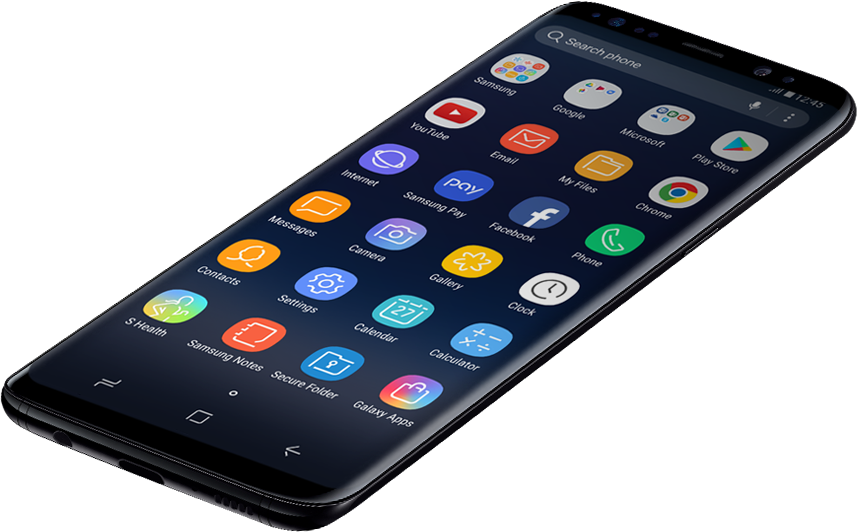
We imbued Samsung’s unique identity into app icons
that have been designed through the newly developed
iconography system. We created an improved variation of
the SamsungOne Font’s dot and applied it to the curves of
the outer square lines that contain the icon graphics.
To increase usability and establish a friendly environment
for newly added apps, we created a color group that
categorizes the apps by priority and function.

Some designs do not require ‘brand’ names to have
recognizable identities, and some designs seem simple,
but have clear functions.
Samsung Mobile’s new visual language maintains a balance between
universality and uniqueness without tilting to either side. This uniform,
yet multi-faceted language will mark the beginning of a whole new
world of expanded experiences for users.