The circular UX of the Samsung Gear S2 & S3 is a new chapter in user
experience as it takes its start from the form of a conventional watch face.
The circular UX utilizes both physical control of the bezel with touch screen capabilities for
an intuitive interface with the device. The 24 detent rotation of the bezel allows the user to
access the app or controls he or she needs without covering the screen. Truly a new experience
for the user as well as the designers who developed this unique innovation.
To achieve this new direction in UX design the designers at Samsung Electronics had to literally
think outside the box. Or in this case, the square, starting from a blank slate. Find out what
challenges they had to overcome to achieve this new and unique UX design.
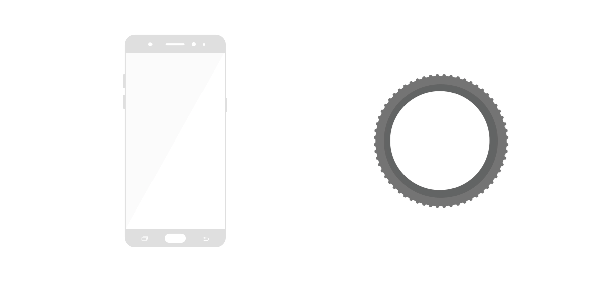
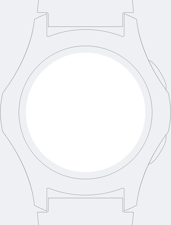
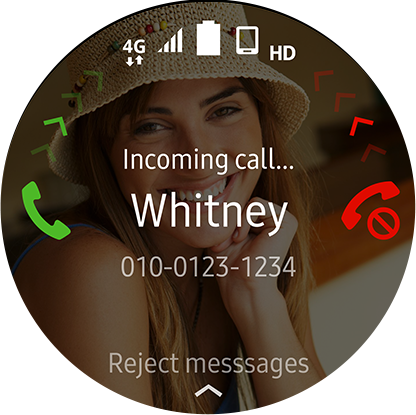
Just breaking away from the conventional square
format of the screen was a major challenge.
The four corners of the square screen, where crucial controls are often placed would simply not work
in a circular environment. Also, due to the considerable size reduction of the screen real estate
the entire design had to be rethought and re-designed from scratch.
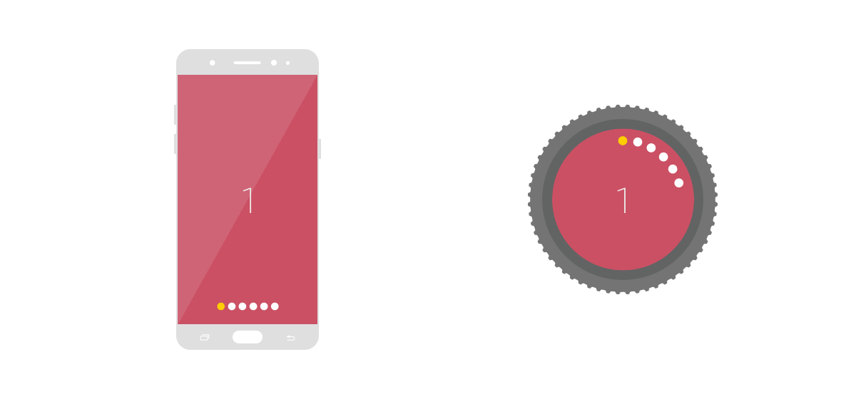
To do this, we had to think outside of the physical restraints of the circle. To think beyond,
if you will by imagining a larger circle around the watch face for a daring new layout. We also utilized
a sense of depth to differentiate between the content in the center and that in the periphery.
Without any corners the result is a user interface that actively displays the content,
for a more focused screen that is optimized for a wearable smart device experience.
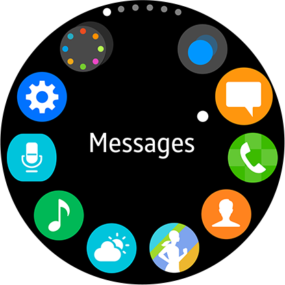
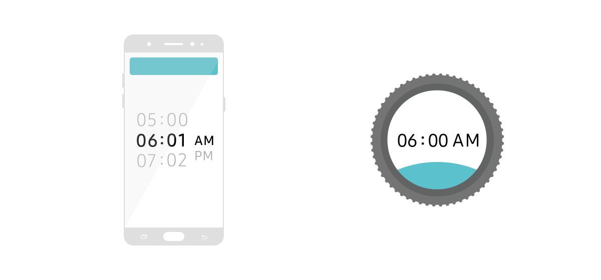
To optimize the circular screen of
the Gear S2 and S3 we added the bezel
as a control function to the touch screen.
This meant developing a new user experience that seamlessly integrated
the control of both the bezel and touch screen interface.
The advantages of a rotating bezel are quick and accurate control without disrupting the screen.
Also, relying on touch without having to look at the device itself is another advantage.
To achieve this, numerous interface and motion design user tests were done to find the most applicable method.
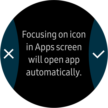
For example, in Apps, it’s as easy to find the application you need as turning the bezel.
Also, selecting a song on the music player or switching the watch face setting is easy as a flick of the wrist.
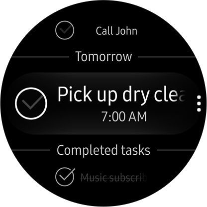
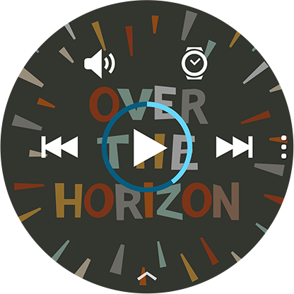
With the successful marriage of form and
interface the Gear S2 & S3 applications have
all undergone a new UX makeover.
Although the physical size of the device has decreased compared to smartphones, the bezel interface counters
such limitations to effectively allow apps a wider range of control and functions in the new user environment.
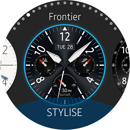
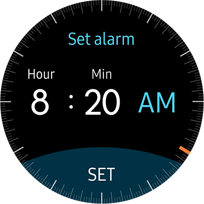
Specifically, the Timer or Alarm app can be set with more ease and accuracy than before,
as it is optimized for a circular screen. The Health app 24-Hour Log setting is easily accessible
with the bezel controls to view your daily activities and records.
Perhaps changing a screen from square to
circle may not seem so innovative.
However, the circular UX is not merely a form change but a totally new way of combining product design and
UX design for an optimized user experience in smart wearable devices. No easy task there.
As this new direction in innovation shows, the circular UX of the Gear S2 & S3 are testament to
Samsung Electronics’ dedication to go forward with new chapters in wearable technology.